Average Annual Temperature World Map

Alex Cartwright
Senior Cartographer & GIS Specialist
Alex Cartwright is a renowned cartographer and geographic information systems specialist with over 15 years of experience in spatial analysis and data...
Geographic Analysis
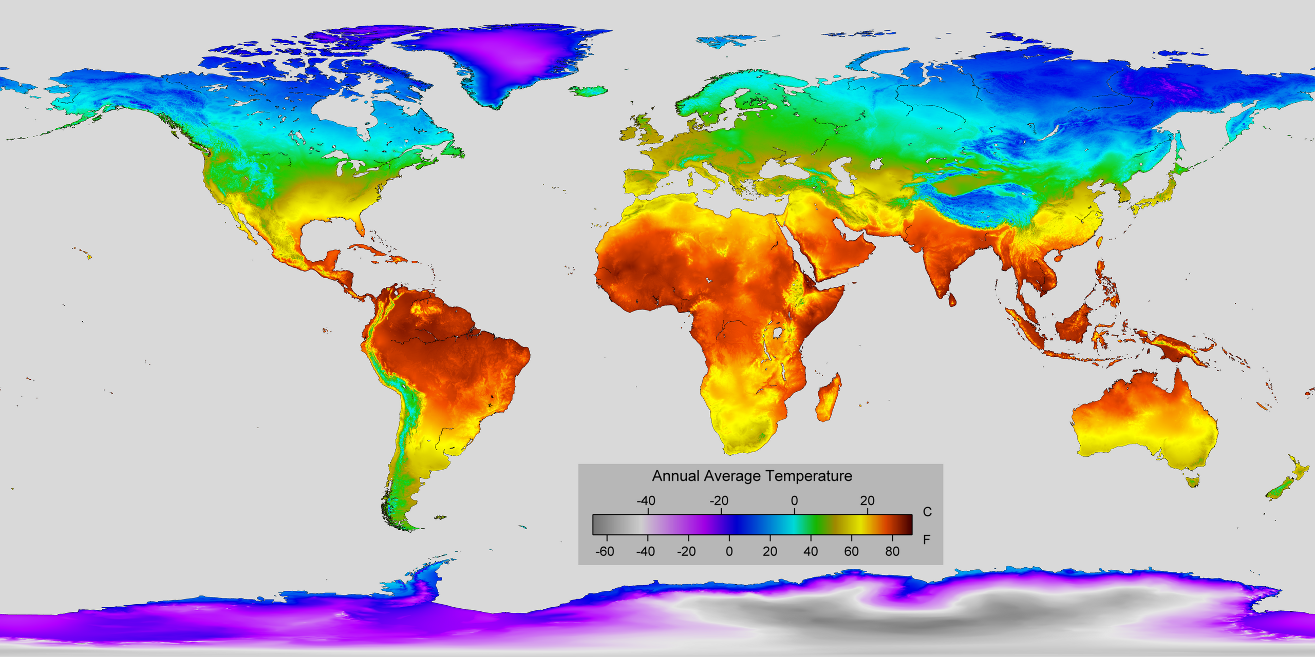
What This Map Shows
The "Average Annual Temperature World Map" provides a comprehensive visual representation of temperature variations across the globe. This map illustrates the average temperature in degrees Celsius or Fahrenheit for different regions, allowing us to understand the climatic conditions that shape our planet. Temperature plays a crucial role in determining weather patterns, ecosystems, and even human activities. By examining this map, we can gain insights into how different areas experience varying climates and what factors contribute to these temperature differences.
Deep Dive into Global Temperature Patterns
Temperature is influenced by a myriad of factors, including latitude, altitude, proximity to oceans, and prevailing wind patterns. Generally, as one moves away from the equator towards the poles, average temperatures tend to decrease. This is primarily due to the angle of sunlight reaching the Earth, which is more direct at the equator and becomes more oblique as one moves north or south.
Interestingly, regions near the equator, such as parts of Africa and Southeast Asia, experience consistently high temperatures throughout the year, often exceeding 25°C (77°F). This is characterized by a tropical climate, where seasonal variations are minimal. Conversely, areas closer to the poles, like northern Canada and Siberia, can have average annual temperatures that plummet well below freezing, often dipping to -10°C (14°F) or lower.
Another vital aspect to consider is how elevation affects temperature. For instance, mountainous regions can experience significant temperature drops as altitude increases. The Andes in South America and the Himalayas in Asia showcase this phenomenon, where temperatures can vary drastically within a short vertical distance. The phenomenon known as the lapse rate—where temperature decreases with altitude—plays a major role in these variations.
Furthermore, ocean currents and wind patterns significantly impact local climates. Coastal areas often have milder temperatures compared to inland regions, thanks to the moderating effects of ocean waters. For example, the west coast of North America, influenced by the Pacific Ocean, experiences cooler summers and milder winters compared to the interior regions, which can see extreme temperature swings.
Regional Analysis
When we analyze the temperature map by regions, the differences become even more pronounced. For instance, Europe generally enjoys a temperate climate, with average temperatures ranging from 5°C (41°F) in the north to 15°C (59°F) in the south. Cities like London and Paris experience mild winters and cool summers, while southern regions like Italy and Spain benefit from a Mediterranean climate characterized by hot, dry summers and mild, wet winters.
In stark contrast, Africa's temperature variations are dramatic, largely influenced by its vast size and diverse landscapes. The Sahara Desert is known for its extreme heat, with temperatures soaring above 50°C (122°F) during the day, while regions like the Congo Basin have average temperatures around 25°C (77°F) and significant rainfall, creating a lush, tropical environment.
Asia presents a complex tapestry of climates as well. For example, India experiences significant seasonal variations due to the monsoon system, with average temperatures ranging from 20°C (68°F) in winter to over 30°C (86°F) in summer. Meanwhile, Russia's vast expanse witnesses some of the coldest temperatures on Earth, particularly in Siberia, where yearly averages can be below -15°C (5°F).
Significance and Impact
Understanding average annual temperatures is crucial for several reasons. It not only informs us about climate patterns but also helps us prepare for the implications of climate change. As global temperatures continue to rise due to human activities, regions that were once temperate may start experiencing extreme weather events, affecting agriculture, water supply, and biodiversity.
Moreover, this topic connects to real-world issues such as migration patterns. People in regions facing unbearable heat or erratic weather may be forced to relocate, which can lead to social and political challenges. Have you noticed that countries with extreme climates often face different agricultural challenges? For instance, drought-prone areas struggle with food security, while regions with excessive rainfall may encounter flooding.
In conclusion, the average annual temperature world map is not just a tool for understanding climate; it is a window into the future challenges we may face. By studying these patterns, we can better prepare for the impacts of climate variability and work towards sustainable solutions that benefit both people and the planet.
Visualization Details
- Published
- October 18, 2025
- Views
- 34
Comments
Loading comments...