GDP PPS Per Capita Comparison Map: Japan and Europe

David Chen
Data Visualization Specialist
David Chen is an expert in transforming complex geographic datasets into compelling visual narratives. He combines his background in computer science ...
Geographic Analysis
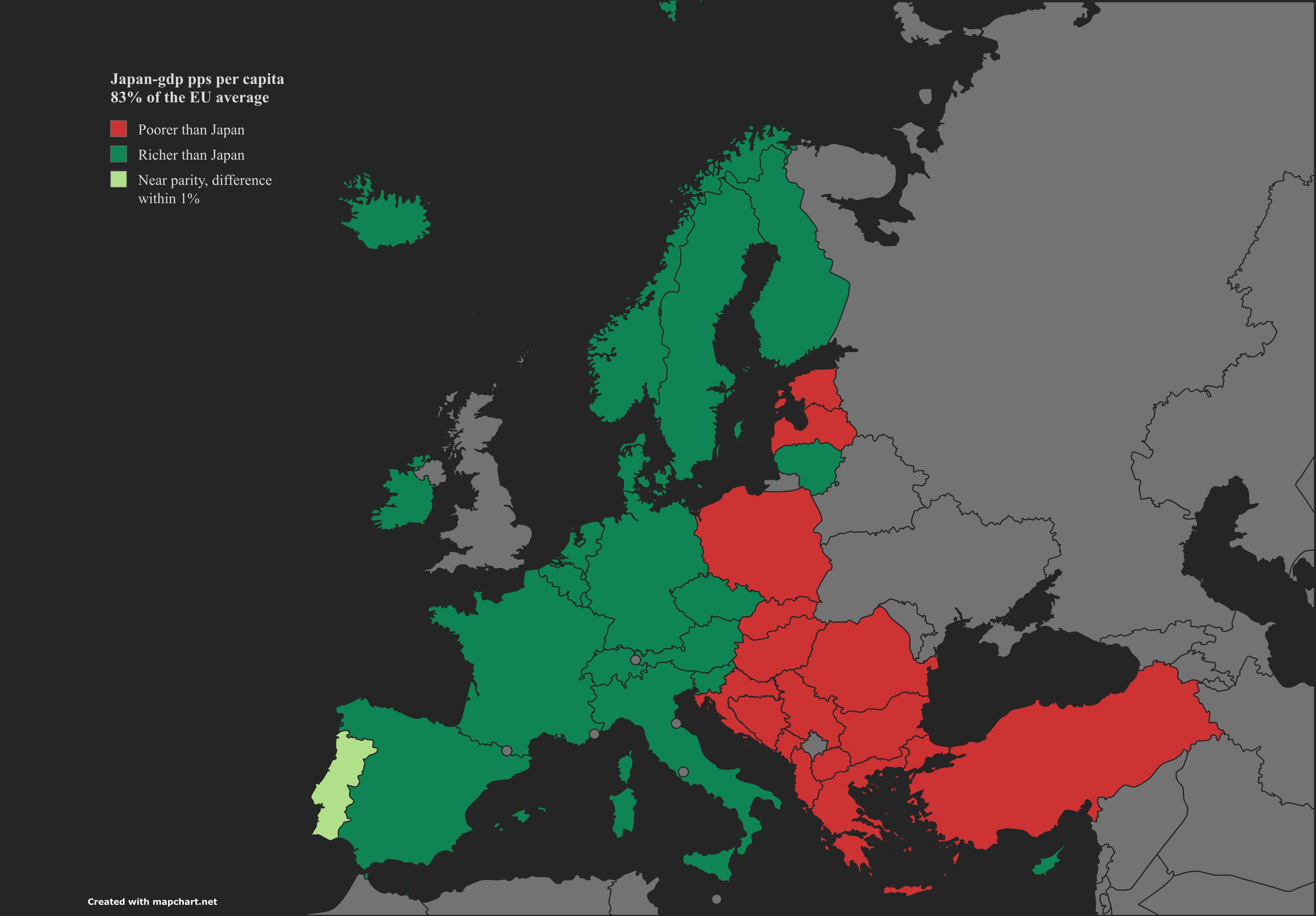
What This Map Shows
The visualization titled "Yen Meets Euro" presents a detailed comparison of Japan's GDP per capita in purchasing power standards (PPS) against various European countries. This map allows us to see how Japan, as one of the largest economies in Asia, stacks up against its European counterparts in terms of economic output per person, adjusted for cost of living differences. Such visualizations are crucial for understanding global economic dynamics and the relative wealth of nations.
Transitioning from the visualization to the core subject, GDP per capita is a critical indicator of economic performance. It reflects the average economic output per person and is often used to gauge a nation’s standard of living. By analyzing the GDP PPS per capita, we can gain insights into how well citizens are able to afford goods and services in their respective countries.
Deep Dive into GDP Per Capita
GDP per capita in purchasing power standards is more than just a number; it encapsulates the economic health and living standards of a nation. Purchasing power parity (PPP) adjusts for price level differences across countries, providing a more accurate depiction of economic well-being than nominal GDP figures. For instance, while Japan may have a high nominal GDP, its cost of living is also significant, making the PPS figure crucial for understanding the real economic picture.
Interestingly, Japan has consistently maintained high GDP PPS per capita figures. According to Eurostat, Japan's GDP PPS per capita was approximately 36,000 euros in recent years, placing it in a competitive position relative to many European nations. However, the landscape within Europe itself is highly varied. Countries such as Luxembourg lead the way with figures soaring over 100,000 euros per capita, primarily driven by its robust financial sector and favorable tax regimes. On the other end of the spectrum, countries like Bulgaria and Romania exhibit much lower GDP per capita figures, reflecting ongoing economic development challenges.
Have you noticed that while Japan's economy is mature and stable, some European nations are experiencing rapid growth? This divergence can be attributed to several factors including demographic trends, industrial diversification, and government policies. For example, Japan is facing an aging population that impacts economic productivity and consumer spending, whereas several Eastern European countries are benefiting from younger populations and increasing foreign investments.
Moreover, the service sector plays a significant role in determining GDP per capita figures. In Japan, the service sector contributes significantly to the economy, accounting for around 70% of GDP. However, some European nations like Germany and France also show robust service sectors alongside strong manufacturing bases, which can enhance their economic resilience and per capita figures.
Regional Analysis
When we delve deeper into the map, we can observe clear regional differences in GDP PPS per capita. For instance, Scandinavian countries like Norway and Sweden consistently rank high, often surpassing Japan. Their economies benefit from extensive welfare systems, high levels of education, and natural resources that contribute to high productivity levels.
In contrast, Southern European nations such as Spain and Italy show a more moderate performance. Economic challenges, including high unemployment rates and debt levels, have hindered their ability to reach the higher GDP PPS per capita seen in Northern Europe. Interestingly, even though Italy has a rich cultural heritage and a strong tourism sector, economic stagnation in recent years has affected its overall GDP performance.
Additionally, the map highlights the economic disparities present in the European Union, where Western nations typically enjoy higher GDP per capita than their Eastern counterparts. This division raises important questions about economic policies and integration within Europe, particularly in light of recent geopolitical developments.
Significance and Impact
Understanding GDP PPS per capita is vital for policymakers, economists, and citizens alike. This metric not only sheds light on a nation's economic health but also impacts social policy decisions, investment strategies, and international relations. For example, countries with lower GDP per capita may seek out foreign investments or financial aid to stimulate their economies. Conversely, nations with higher GDP may focus on innovation and sustainability to maintain their economic edge.
Looking ahead, trends such as globalization, technological advancements, and demographic shifts will continue to shape GDP per capita figures across nations. Japan, while facing challenges like an aging workforce, is also investing in technology and robotics to enhance productivity. Meanwhile, European nations are grappling with the impact of Brexit, evolving trade relationships, and varying recovery speeds post-COVID-19.
In conclusion, the "Yen Meets Euro" map not only serves as a visual representation of economic data; it encapsulates the complex interplay of factors that influence the economic landscape in Japan and Europe. By understanding these dynamics, we can better appreciate the challenges and opportunities that lie ahead in the global economy.
Visualization Details
- Published
- August 13, 2025
- Views
- 94
Comments
Loading comments...