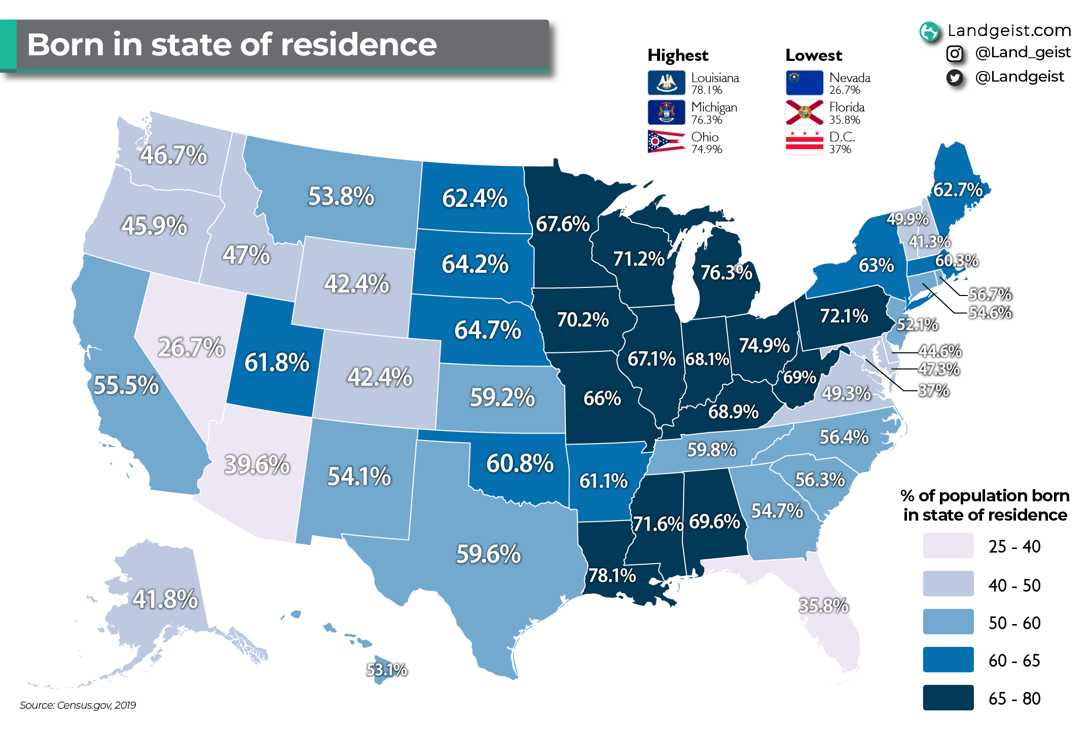
Map of People Living in Birth States

Marcus Rodriguez
Historical Geography Expert
Marcus Rodriguez specializes in historical cartography and geographic data analysis. With a background in both history and geography, he brings unique...
Geographic Analysis
What This Map Shows
The map titled "Percentage of People Living in the State They Were Born" provides a fascinating look into the demographic patterns of the United States. It visually represents the percentage of individuals who remain in their birth state, revealing trends and insights about migration, community ties, and regional characteristics. The visualization allows us to see at a glance where people are most likely to stay close to their roots and where they are more inclined to venture away for new opportunities.
Deep Dive into Migration Trends
When we think about migration, several factors come into play, all of which can influence whether individuals choose to stay in their birth state or explore opportunities elsewhere. Interestingly, the reasons behind these decisions range from economic opportunities to family connections and quality of life.
One of the most significant influences on whether people remain in their birth state is the availability of jobs. States with robust economies, like California and Texas, attract individuals from across the nation, often pulling people away from their birthplaces. Conversely, states with weaker job markets may see higher percentages of residents sticking around simply because the local economy offers fewer alternatives. For instance, states in the Midwest, such as Ohio and Michigan, show a high percentage of residents who remain due to familial ties or a relatively stable but less dynamic job market.
Another crucial factor is education. Many young adults leave their home states for higher education and find new opportunities in urban areas or more prosperous states. This trend is particularly evident in states like Massachusetts, where a high percentage of college graduates move to larger cities for jobs, leading to a lower retention rate of younger populations. However, what’s intriguing is that some states, such as Vermont and Maine, have much higher retention rates, indicating a strong connection to community and lifestyle that keeps people anchored.
Furthermore, cultural and social factors play a role. Regions with a distinct cultural identity, such as the Deep South or New England, often foster a sense of belonging that encourages residents to stay. Family structures and social networks can weigh heavily on the decision to remain in one’s birth state, as individuals often prioritize proximity to family and friends.
Regional Analysis
Looking at the map, the regional disparities in retention rates are quite telling. In the Northeast, for example, states like New York and Pennsylvania show diverse retention percentages, with urban centers like New York City pulling people away, while rural areas retain more of their populations. The Midwest generally has higher retention rates, with states like Iowa and Nebraska showing that many individuals choose to stay close to their roots, often tied to agricultural lifestyles and community bonds.
Conversely, the West Coast, notably California and Washington, has lower retention rates. This is particularly interesting given the state’s high population density and economic opportunities that attract individuals from other regions. The allure of tech jobs in Silicon Valley or the vibrant culture of Seattle often leads to a brain drain from states with less economic vibrancy.
Interestingly, the Southern states show a mixed bag of results. States like Texas and Florida have higher rates of in-migration, which can skew the data, making it appear that fewer residents are staying put. However, the actual retention rates of native-born residents in these states can be quite high, suggesting a complex interplay of migration and local demographics.
Significance and Impact
Understanding the dynamics of where people choose to live in relation to where they were born is more than just a matter of statistics; it has real-world implications. For policymakers, these trends can inform decisions about economic development, infrastructure, and community resources. For instance, areas with high retention rates may require different types of services than those that experience significant out-migration.
Moreover, as we continue to see changes in the job market, especially in the wake of globalization and technological advancement, the patterns depicted in this map could shift dramatically. Current trends indicate that remote work is allowing more people to live where they choose rather than where their job is based. This could lead to increased migration to rural areas, which may, in turn, affect retention rates in traditionally stable regions.
What’s fascinating is that this map serves as a snapshot of both tradition and change, capturing the essence of how deeply connected we are to our places of origin while also highlighting the modern realities of mobility. As we reflect on these trends, it raises the question: how will future generations balance the pull of their roots with the lure of opportunity elsewhere? The answers lie in the evolving tapestry of American demographics, influenced by economic, cultural, and social factors that will shape our landscape for years to come.
Visualization Details
- Published
- October 27, 2025
- Views
- 12
Comments
Loading comments...