Map Size vs Actual Size Map

Marcus Rodriguez
Historical Geography Expert
Marcus Rodriguez specializes in historical cartography and geographic data analysis. With a background in both history and geography, he brings unique...
Geographic Analysis
What This Map Shows
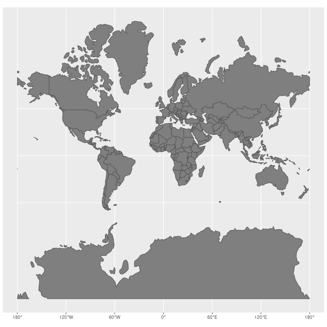
The "Map Size vs Actual Size" visualization provides a striking comparison between the way various geographical areas are represented on typical maps and their actual land areas. This map highlights the common distortions that occur when we translate the three-dimensional surface of the Earth into two-dimensional representations. Ever wondered why Greenland appears so large on some maps? Or why Africa seems smaller than it actually is? This visualization helps clarify those misconceptions and encourages a deeper understanding of the true scale of countries and continents.
Deep Dive into Map Projections
Map projections are methods used to represent the three-dimensional Earth on a two-dimensional surface, and they often involve trade-offs between accuracy and usability. For instance, the Mercator projection, one of the most widely recognized map types, preserves angles and shapes but dramatically distorts sizes, especially as you move away from the equator. This means that while countries like Greenland look massive, they are actually far smaller than they appear.
Interestingly, the true size of Africa is often underestimated due to these projection inaccuracies. In reality, Africa is about 14 times larger than Greenland. This misconception can have real implications on how we perceive the continent's resources, population density, and geopolitical significance. The Peters projection, on the other hand, aims to present countries in their true proportions, but it sacrifices shape accuracy, leading to distortions in how we perceive the shapes of countries.
Another fascinating aspect of map projections is the impact they have on our understanding of geography. For example, the Robinson projection tries to strike a balance between size and shape, providing a more visually appealing representation of the world that can be more intuitive for educational purposes. However, it still doesn't convey the full reality of land sizes, leading to ongoing debates about the best methods for teaching geography in schools.
Regional Analysis
When examining specific regions through the lens of this map, significant variations emerge. For instance, consider Europe and Africa. Europe, often depicted as a dominant force in global affairs, is much smaller than it appears on standard maps. In contrast, Africa, which is rich in resources and cultural diversity, is often relegated to a smaller space on the map, leading to a skewed understanding of its importance in global context.
Moreover, countries like Russia, which is the largest country in the world, also suffer from distortions in representation. On many maps, it appears far smaller than it truly is due to the projection methods used. This can lead to misconceptions about its geopolitical influence and capabilities.
In Asia, the variations become even more striking. Countries like India and China, both of which have vast land areas and populations, are often shown in a way that minimizes their geographical significance. When viewed accurately, these countries emerge as central players in global economics and politics, further emphasizing the importance of understanding true sizes.
Significance and Impact
Understanding the differences between map size and actual size is crucial for a variety of reasons. It affects education, international relations, and even resource allocation. When policymakers rely on distorted maps, they may misjudge the importance of certain regions or fail to recognize potential areas for development or humanitarian aid.
Moreover, in an increasingly globalized world, perceptions matter. Misunderstandings about the size and scale of countries can lead to stereotypes, biases, and even conflicts. As we move forward, the need for accurate mapping becomes more crucial. The rise of digital mapping technologies and geographic information systems (GIS) presents an opportunity to address these issues and foster a better understanding of our world’s geography.
In conclusion, the "Map Size vs Actual Size" visualization is more than just a tool for comparison; it’s a gateway to understanding our world in its true proportions. As we become more aware of the importance of accurate geographical representations, we can make better-informed decisions that reflect the realities of our global society.
Visualization Details
- Published
- October 20, 2025
- Views
- 8
Comments
Loading comments...