Map of US Slavery Trends 1776-1860

Marcus Rodriguez
Historical Geography Expert
Marcus Rodriguez specializes in historical cartography and geographic data analysis. With a background in both history and geography, he brings unique...
Geographic Analysis
What This Map Shows
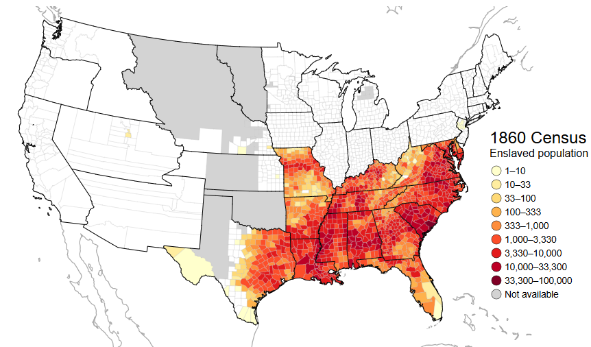
The map titled "The Rise and Fall of US Slavery, 1776-1860" provides a comprehensive visualization of the expansion and contraction of slavery across the United States from the late 18th century to the mid-19th century. By illustrating the geographic distribution of enslaved populations over time, the map highlights key trends, such as the increasing entrenchment of slavery in the southern states and the gradual decline in the northern states. The changes in slave populations reflect broader social, economic, and political shifts of the era, including the impact of abolitionist movements and legislative changes.
Deep Dive into US Slavery
Slavery in the United States has its roots deeply embedded in the nation’s colonial period, but it gained a formal foothold post-1776 with the establishment of the United States. By the 1790s, slavery was a critical economic engine, especially in the southern states, where agricultural production—particularly of tobacco, rice, and later cotton—relied heavily on enslaved labor. Interestingly, the invention of the cotton gin in 1793 by Eli Whitney revolutionized cotton production, leading to a surge in demand for slave labor.
By the early 1800s, the internal slave trade flourished, with enslaved individuals being transported from upper southern states like Virginia to deeper southern states such as Mississippi and Alabama. This movement was not just a change in geography but also a significant demographic shift, as the number of enslaved people grew exponentially in the Deep South. In fact, by 1860, the enslaved population in the United States reached approximately 4 million, with the vast majority residing in southern states.
However, the northern states began to diverge from this trajectory. Although slavery was still present, the gradual abolition movements gained momentum, resulting in significant legislative changes. By 1804, New Jersey became the last northern state to pass a gradual emancipation law. The economic structures of the north, which were increasingly industrialized, did not rely on slavery in the same way as the agrarian south. This marked a crucial turning point in the nation’s history, as the debates over slavery began to intensify, leading to socio-political divides that would eventually culminate in the Civil War.
What’s fascinating is how the landscape of slavery was not static; it was influenced by various factors, including economic conditions, political decisions, and social movements. Enslaved people themselves played a significant role in this history through acts of resistance, both subtle and overt. The map effectively captures this dynamic, showing how the institution of slavery was both a deeply entrenched system and one that was constantly contested and challenged.
Regional Analysis
Let’s break down the map by examining the regional differences in the institution of slavery during this period. In the Upper South, states like Virginia and Maryland had a higher proportion of enslaved individuals in urban settings, where they often worked in skilled trades. This contrasts sharply with the Lower South, where states like South Carolina and Louisiana saw a disproportionate number of enslaved individuals working in large-scale plantations. For instance, in 1860, South Carolina had approximately 57% of its population enslaved, showcasing a stark contrast to states like Pennsylvania, where slavery was nearly eradicated.
The map also illustrates the role of border states—like Kentucky and Missouri—which maintained slavery but were at the forefront of the conflict over this institution. These states often found themselves torn between the economic benefits of slavery and the growing abolitionist sentiment.
Interestingly, the significance of the Mississippi River cannot be overlooked in this discussion. It served as a crucial transportation route for the cotton trade, and by extension, it became central to the slave economy, allowing for the movement of enslaved people and goods across state lines. The map visually encapsulates how geography and economy intertwined to shape the institution of slavery in different regions.
Significance and Impact
Understanding the rise and fall of slavery in the U.S. is vital for comprehending modern American society. The legacy of slavery continues to influence social structures, racial dynamics, and economic disparities in the country. The map serves as a visual reminder of a painful history that shaped the nation’s legal, cultural, and social landscape.
Today, discussions surrounding race relations, reparations, and systemic inequality frequently draw upon this historical context. The ramifications of slavery are still felt, as communities strive to address the injustices that arose from this institution. In light of current events, such as increased movements for racial justice and equality, examining this historical map provides crucial insights into the roots of these contemporary struggles.
In conclusion, the map titled "The Rise and Fall of US Slavery, 1776-1860" is not merely a representation of historical data; it is a powerful tool for understanding the complexities of American history and its ongoing impact. By engaging with this map, we can better appreciate the intricate tapestry of geography, economics, and humanity that defines the legacy of slavery in the United States.
Visualization Details
- Published
- September 19, 2025
- Views
- 72
Comments
Loading comments...