Labor Force Participation Rate Map for Males Ages 20-64

David Chen
Data Visualization Specialist
David Chen is an expert in transforming complex geographic datasets into compelling visual narratives. He combines his background in computer science ...
Geographic Analysis
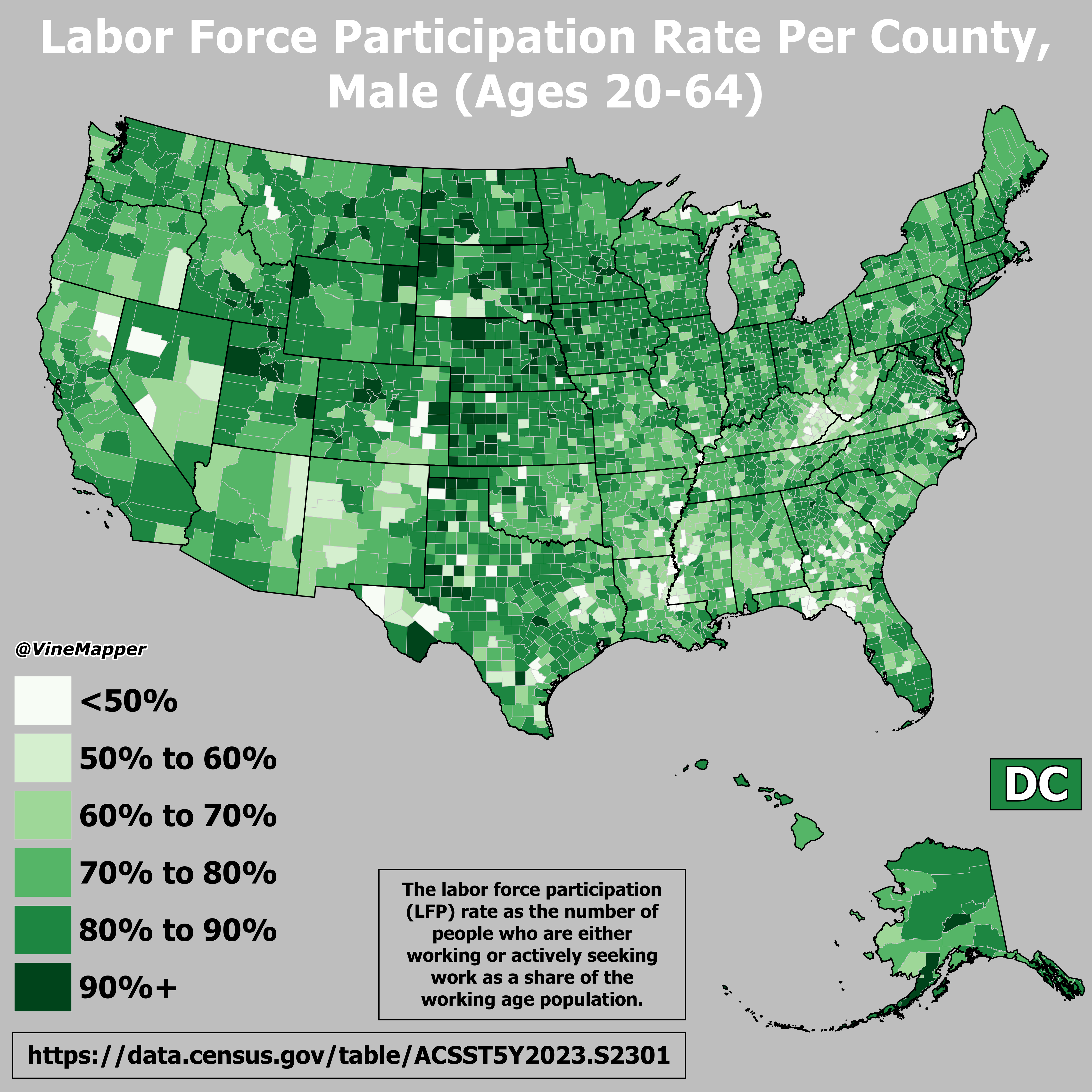
What This Map Shows
This map visualizes the labor force participation rate of males aged 20 to 64 across the United States. It highlights the percentage of men in this age group who are actively engaged in the labor market, providing insights into employment trends, economic conditions, and demographic shifts. Labor force participation is a crucial indicator not only of economic health but also of social dynamics, reflecting changes in lifestyle, education, and family structures.
Deep Dive into Labor Force Participation Rates
Labor force participation rates are a critical component of understanding economic activity within a region. They represent the share of the working-age population that is either employed or actively seeking work. For males aged 20 to 64, these rates can fluctuate based on various factors, including economic conditions, educational attainment, and social norms.
Interestingly, the labor force participation rate for men has seen significant changes over the past few decades. In the late 20th century, participation rates were much higher, often exceeding 90% in many states. However, recent trends have shown a decline, with rates hovering around 80% in many regions as of 2023.
This decline can be attributed to several factors: the increase in educational pursuits, shifts in industry demand, and changing family dynamics. For instance, more men are opting to pursue higher education, often delaying their entry into the workforce. Additionally, the rise of technology and automation has transformed job availability, with many traditional roles becoming obsolete.
Moreover, the COVID-19 pandemic has had a profound impact on labor markets, leading to unprecedented shifts in participation rates. Many men found themselves reassessing their career paths during lockdowns, leading to either voluntary withdrawal from the job market or delays in re-entering the workforce.
Geographically, the labor force participation rate varies significantly across states and regions, reflecting local economic conditions. States with thriving industries, such as Texas and California, typically report higher participation rates, while regions with economic downturns or reliance on declining industries, like parts of the Rust Belt, often show lower rates.
Regional Analysis
When examining the map closely, you might notice distinct regional patterns. For instance, states in the Midwest, such as Ohio and Michigan, often report lower labor force participation rates for males in this age group, primarily due to the decline of manufacturing jobs. Conversely, states in the South and West, like Florida and Utah, tend to exhibit higher rates, likely influenced by robust job markets and the influx of younger populations seeking opportunities.
Interestingly, states like North Dakota have experienced a surge in participation rates due to booming energy sectors, drawing workers from various backgrounds. On the other hand, states with aging populations, such as Maine, face challenges in maintaining robust participation rates as the workforce shrinks with demographic shifts.
Furthermore, urban areas tend to show different patterns compared to rural regions. Cities like New York and San Francisco, characterized by diverse economies and higher living costs, can attract a younger, more dynamic workforce, which might explain the higher participation rates in these urban centers. In contrast, rural states may struggle with attracting young talent, leading to overall lower participation rates.
Significance and Impact
Understanding labor force participation rates is crucial for policymakers, economists, and businesses alike. High participation rates often indicate a healthy economy, while lower rates can signal underlying issues that may require intervention. For example, in regions where participation is declining, local governments may need to invest in job training programs or incentives to attract businesses.
Additionally, the implications of these rates extend beyond economics. They can affect social structures, community engagement, and even public health. For instance, areas with lower participation may see higher rates of poverty or social issues, which can have cascading effects on education and healthcare.
Looking to the future, demographic trends such as aging populations and shifts in migration patterns will likely continue to influence labor force participation rates. As the workforce evolves, understanding these dynamics will be key to fostering economic resilience and ensuring that all demographics are represented in the labor market.
In conclusion, the labor force participation rate for males aged 20 to 64 not only serves as an economic indicator but also provides a window into the evolving landscape of work in America. By analyzing this map and its underlying data, we can better grasp the current state of the workforce and anticipate future trends that will shape our economy and society as a whole.
Visualization Details
- Published
- August 29, 2025
- Views
- 76
Comments
Loading comments...