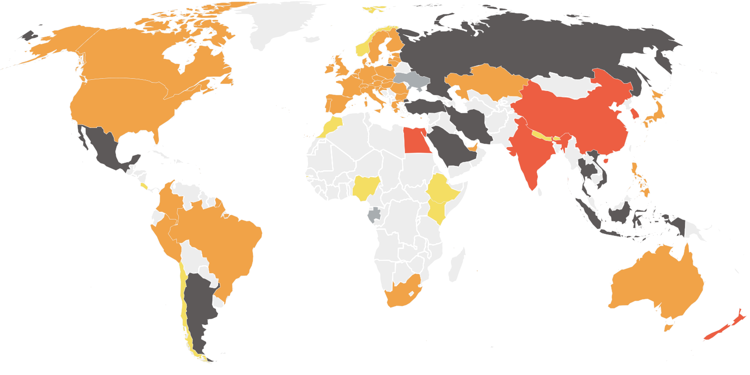
Map of Countries' Progress on Paris Agreement Goals

Marcus Rodriguez
Historical Geography Expert
Marcus Rodriguez specializes in historical cartography and geographic data analysis. With a background in both history and geography, he brings unique...
Geographic Analysis
What This Map Shows
The "Map of Each Country's Progress on the Paris Agreement Goal to Limit Global Warming to 1.5°C" provides a stark visual representation of how nations are faring in their commitments to combat climate change. Utilizing a color-coded system, countries are classified from critically insufficient to almost sufficient based on their ability to meet the ambitious targets set forth by the Paris Agreement. The colors range from black (⚫) for critically insufficient to green (🟢) for 1.5°C compatible, with no countries currently achieving this ideal. Notably, countries that did not have to submit their goals are marked in white or grey, highlighting the disparities in accountability and ambition across the globe.
Deep Dive into Climate Action Commitments
The Paris Agreement, adopted in 2015, is a landmark international treaty aimed at limiting global warming to well below 2°C above pre-industrial levels, with an aspirational goal of 1.5°C. The significance of this target cannot be overstated; keeping warming below 1.5°C is projected to significantly reduce the risks and impacts of climate change, particularly for vulnerable populations. However, the map tells a different story, showcasing the varying degrees of commitment among nations.
Interestingly, many countries fall within the red (🔴) and orange (🟠) categories, indicating a high level of insufficiency. This means that their current policies and actions are grossly inadequate to meet the Paris Agreement's targets. For instance, major economies like the United States and China, while having made some strides in renewable energy, still heavily rely on fossil fuels that contribute to greenhouse gas emissions. In contrast, some smaller nations that are more vulnerable to climate impacts, such as Tuvalu and the Maldives, have been vocal advocates for more stringent global action, emphasizing their precarious position in the face of rising sea levels.
Statistics reveal that global CO2 emissions must be halved by 2030 to stay within the 1.5°C threshold. However, many nations are not on track to achieve this goal. The map reflects these realities, raising critical questions about the future of our planet. Have you noticed how the countries most affected by climate change often contribute the least to the problem?
Moreover, the challenges of transitioning to a low-carbon economy are compounded by socio-economic factors. In many cases, countries that are heavily reliant on fossil fuels for economic growth face significant barriers to change. This economic dependence creates a cycle that is difficult to break, leading to insufficient action and a lack of progress.
Regional Analysis
When examining the map regionally, the contrasts become even more pronounced. In Europe, many countries are making strides toward climate compatibility. Nations like Sweden and Denmark are often cited as leaders in renewable energy and sustainability practices. These countries have implemented aggressive policies to reduce carbon emissions and invest in green technologies, which are visibly reflected in their progress on the map.
On the other hand, regions like South Asia exhibit a troubling trend. Countries such as India and Pakistan are faced with severe air quality issues and a growing reliance on coal, which positions them in the highly insufficient categories. The juxtaposition of these regions underscores the complexities of global climate governance. Interestingly, while developed nations bear a historical responsibility for carbon emissions, developing nations are often on the front lines of climate impacts, which raises ethical questions about equity in climate action.
Moreover, Africa presents a mixed landscape. Countries like Morocco are leading the charge with ambitious renewable energy initiatives, while others, grappling with political instability or economic challenges, struggle to make significant progress. The map vividly illustrates these disparities, highlighting the urgent need for tailored support and financing for nations that require assistance in their transition to a sustainable future.
Significance and Impact
Understanding the implications of this map is crucial not just for policymakers but for everyone. The failure of countries to meet their Paris Agreement targets has profound consequences, affecting everything from weather patterns to global food security. As climate change intensifies, we can expect more frequent and severe weather events, which will disproportionately impact the most vulnerable communities around the globe.
Furthermore, the ongoing progress, or lack thereof, directly influences international relations, trade agreements, and migration patterns. Countries that lead in climate action may find themselves in strong positions on the global stage, while those lagging behind could experience increasing isolation.
Looking ahead, the urgency to act has never been clearer. Future projections indicate that without immediate and profound changes in policy and behavior, we could face catastrophic climate scenarios that would alter life as we know it. The map serves as a call to action, reminding us that the time for transformation is now. What steps can we take, both individually and collectively, to encourage our nations to step up?
In conclusion, the map not only visualizes the current state of global climate action but also highlights the pressing need for unity, innovation, and accountability in the journey toward a sustainable future. As we navigate this critical period, understanding these dynamics will be essential in shaping effective responses to one of the greatest challenges of our time.
Visualization Details
- Published
- August 20, 2025
- Views
- 252
Comments
Loading comments...