Stunning Map Reveals Projected Population Loss By 2050

Alex Cartwright
Senior Cartographer & GIS Specialist
Alex Cartwright is a renowned cartographer and geographic information systems specialist with over 15 years of experience in spatial analysis and data...
Geographic Analysis
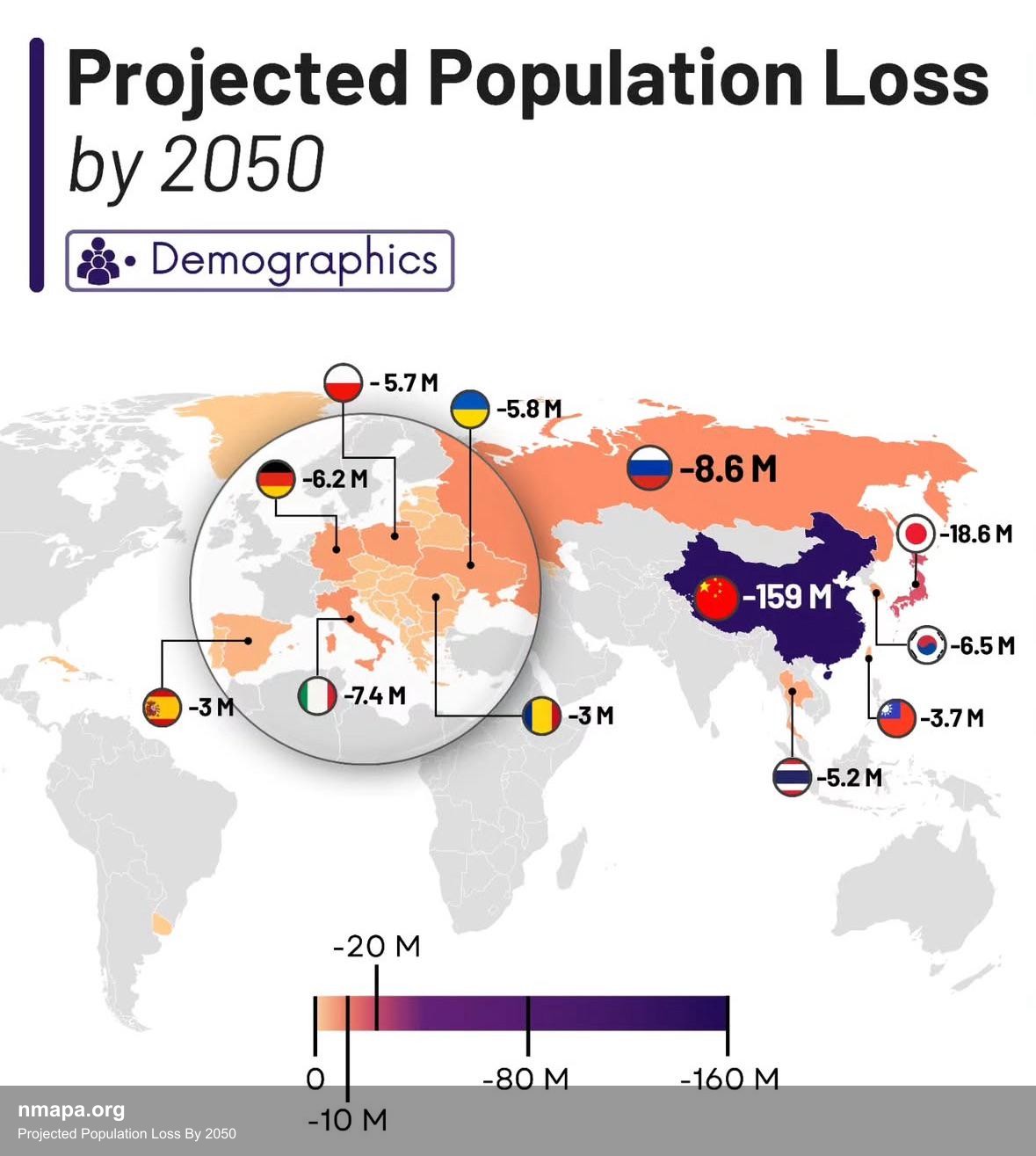
The 'Projected Population Loss By 2050' map presents a compelling visual representation of anticipated demographic changes across the globe. This visualization highlights regions expected to experience significant declines in population, using a color-coded scheme to indicate varying degrees of loss. Darker shades typically represent areas facing the most severe reductions, while lighter shades suggest more stable population numbers. Key regions such as Eastern Europe, parts of Japan, and certain areas in North America are projected to see the most dramatic declines, raising critical questions about the socio-economic implications of these shifts.
Understanding the significance of this map requires an appreciation of its geographical context. Population dynamics are influenced by various factors, including birth rates, mortality rates, and migration patterns. Regions that are expected to lose population often grapple with challenges such as aging demographics, economic stagnation, and out-migration of younger individuals seeking opportunities elsewhere. The map serves not only as a predictive tool but also as a catalyst for discussions surrounding resource allocation, urban planning, and policy-making.
Historically, regions that are marked for population loss have undergone significant transformations. For example, post-Soviet nations in Eastern Europe, including countries like Bulgaria and Latvia, have faced steep declines in birth rates and increased emigration since the dissolution of the USSR. This phenomenon has compounded existing economic challenges and led to a shrinking labor force, which can stifle growth and innovation. Similarly, Japan's population decline is a result of both low birth rates and a reluctance to embrace immigration, a trend that poses serious questions about the country’s future economic viability.
Culturally, the implications of population loss are profound. Communities shrink, leading to changes in social structure and local economies. As populations decline, schools may close, public services may suffer, and cultural heritage sites may be neglected. The map encourages viewers to consider the human stories behind the numbers—families that have left, communities that have disbanded, and the cultural richness that may be at risk of fading away.
Regional patterns depicted in the map reveal stark contrasts between different parts of the world. While some areas in Sub-Saharan Africa and parts of Asia are projected to see population growth, often due to higher birth rates and youthful populations, regions like Western Europe and North America face an uncertain demographic future. This divergence emphasizes the importance of policy responses tailored to the unique needs of each region. Countries experiencing population loss might focus on attracting immigrants to counteract declines, while those with growth might need to implement sustainable development practices to manage rapid urbanization.
The educational value of the 'Projected Population Loss By 2050' map is immense. It encourages viewers to engage with the concept of population dynamics, prompting questions about sustainability, resource management, and social equity. Students and educators can use this visualization as a springboard for discussions on global issues such as climate change, migration patterns, and economic development. It also serves as a reminder of the interconnectedness of global demographics—how population changes in one region can have ripple effects worldwide.
Moreover, this type of geographical visualization is crucial for understanding geography in a modern context. It combines statistical data with visual storytelling, making complex information more accessible. Maps like this one allow for the synthesis of large datasets, providing a clear picture of trends that might otherwise be overlooked in raw numbers. They serve as valuable tools for policymakers, researchers, and the public, enhancing our understanding of the geographical implications of demographic changes.
Ultimately, the connections to broader geographical concepts are significant. The map illustrates the importance of population geography, a subfield that explores the relationships between people and their environments. It underscores how demographic trends can influence economic development, urbanization, and even political stability. By engaging with this visualization, viewers gain insight into how our world is evolving and the challenges and opportunities that lie ahead as we approach the year 2050.
Visualization Details
- Published
- August 1, 2025
- Views
- 66
Comments
Loading comments...