Heat Map of NYC Area Streets Usage

David Chen
Data Visualization Specialist
David Chen is an expert in transforming complex geographic datasets into compelling visual narratives. He combines his background in computer science ...
Geographic Analysis
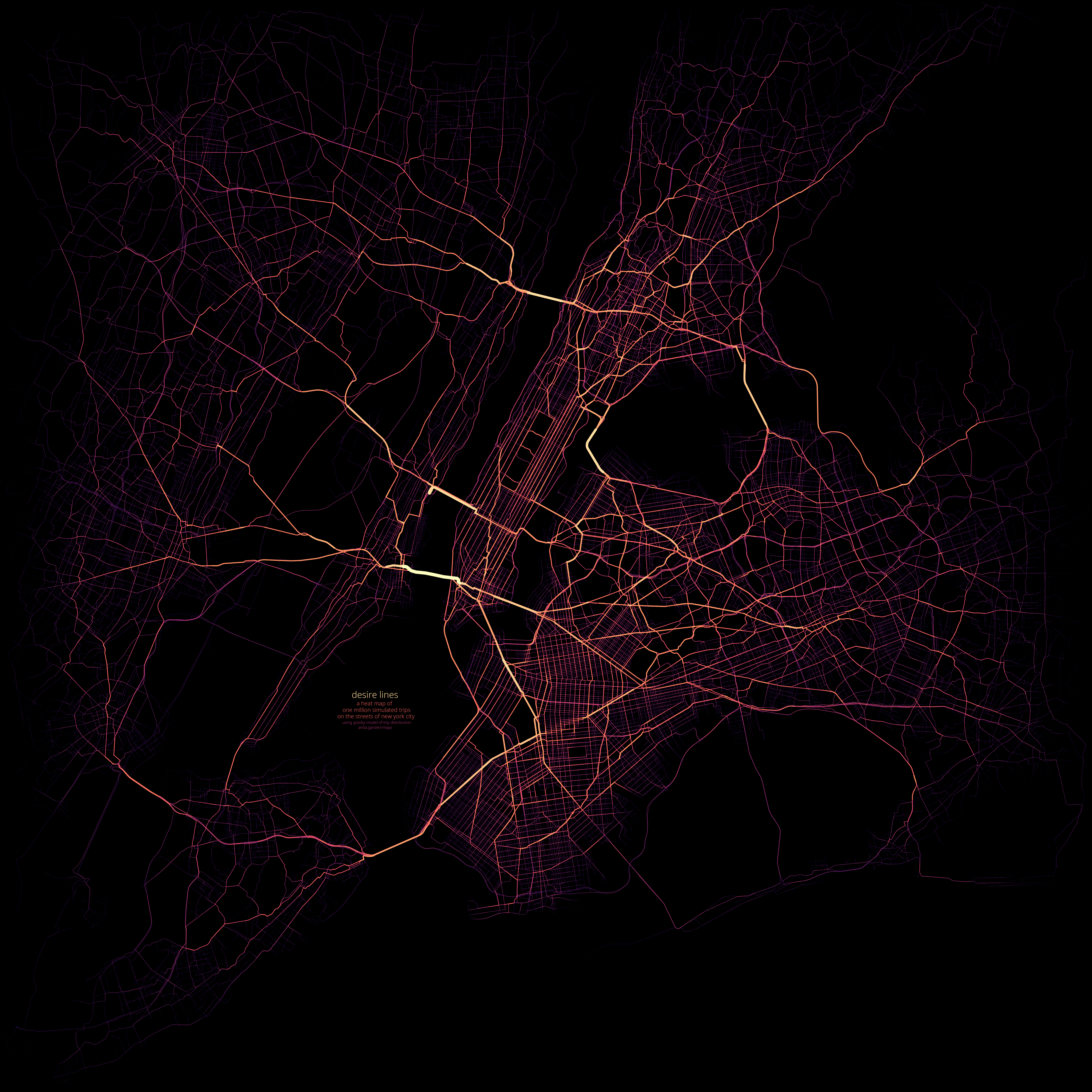
What This Map Shows
The heat map of one million simulated trips on NYC area streets presents a dynamic visualization of urban mobility patterns throughout the city. By utilizing a gravity model to select random trip origins and destinations based on population density, this map illustrates how frequently different streets are used by pedestrians and vehicles in New York City. The streets are colored based on usage frequency, allowing viewers to quickly identify the most traversed routes and, conversely, those that see less foot or vehicle traffic. The underlying data is sourced from OpenStreetMap and population density metrics from Kontur, creating a rich, data-driven picture of urban movement.
Deep Dive into Urban Mobility in NYC
Urban mobility is an essential aspect of city life, impacting everything from traffic congestion to public health. In New York City, a sprawling metropolis known for its vibrant streets and diverse neighborhoods, understanding how people navigate the city can shed light on broader societal trends. The concept of mobility encompasses various forms of transportation, including walking, cycling, driving, and public transit. However, walking and short trips dominate urban travel patterns in NYC, as indicated by this heat map.
Interestingly, the gravity model used to simulate trip origins and destinations highlights a critical relationship between population density and travel behavior. Higher population density areas, such as Manhattan, naturally generate more trips, leading to increased street usage. For instance, the iconic streets of Midtown and Lower Manhattan are often teeming with pedestrians, reflecting the concentration of businesses, restaurants, and cultural landmarks. Conversely, residential neighborhoods in the outer boroughs may exhibit lower street usage due to less foot traffic and fewer commercial activities.
Moreover, this map reveals how distance influences trip frequency. The gravity model’s reliance on the inverse square of distance means that shorter trips are significantly more prevalent than longer ones. This aligns with findings from various urban studies suggesting that most urban trips are under three miles. The map's visualization thus provides key insights into how urban planning can prioritize pedestrian and cyclist-friendly routes, potentially reducing reliance on cars and enhancing sustainability.
Regional Analysis
Examining the NYC area through the lens of this heat map reveals distinct variations in street usage across different boroughs. For instance, in Manhattan, streets like Broadway and Fifth Avenue are highlighted in bright colors, indicating their status as major thoroughfares. These streets not only accommodate high volumes of pedestrian traffic but also serve as critical connectors for public transit systems, further enhancing their usage.
In contrast, neighborhoods in Brooklyn and Queens show a mix of vibrant and quieter streets. Areas like Williamsburg and Astoria experience significant foot traffic due to their burgeoning restaurants and entertainment venues, while more residential neighborhoods may demonstrate lower usage levels. The heat map effectively captures this contrast, allowing for an understanding of how urban development impacts transportation patterns.
The Bronx and Staten Island exhibit different trends as well. The Bronx, with its mix of residential blocks and commercial corridors, shows moderate street usage, while Staten Island's suburban layout results in less pedestrian traffic overall. Here, the streets are often less traversed, emphasizing the need for a more connected transit system to encourage mobility.
Significance and Impact
Understanding the intricacies of urban mobility in a city as dense as New York is crucial for several reasons. Firstly, it allows city planners and policymakers to identify which streets may require enhancements in infrastructure, such as wider sidewalks, more bike lanes, or improved public transit access. For example, the heat map indicates where congestion may peak, facilitating targeted interventions that can improve pedestrian safety and ease traffic flow.
Moreover, as cities worldwide grapple with issues like climate change and urban sprawl, insights drawn from such mobility patterns can help inform sustainable urban development strategies. Promoting walking and cycling in areas highlighted on the map can lead to reduced carbon emissions and a healthier urban populace.
Furthermore, the ongoing evolution of NYC’s transportation landscape, including the integration of subway data in future iterations of this map, will likely provide even more nuanced insights into how residents navigate their environment. As urban mobility continues to change, maintaining a pulse on these trends will be essential for fostering a more accessible, sustainable, and vibrant city.
Ultimately, this heat map not only serves as a visualization of street usage in NYC but also as a tool for understanding the dynamics of urban life. By connecting the data to real-world implications, we can better appreciate the significance of our streets in shaping the experiences of millions of New Yorkers every day.
Visualization Details
- Published
- October 5, 2025
- Views
- 46
Comments
Loading comments...