UK Job Pay Distribution Map

David Chen
Data Visualization Specialist
David Chen is an expert in transforming complex geographic datasets into compelling visual narratives. He combines his background in computer science ...
Geographic Analysis
What This Map Shows
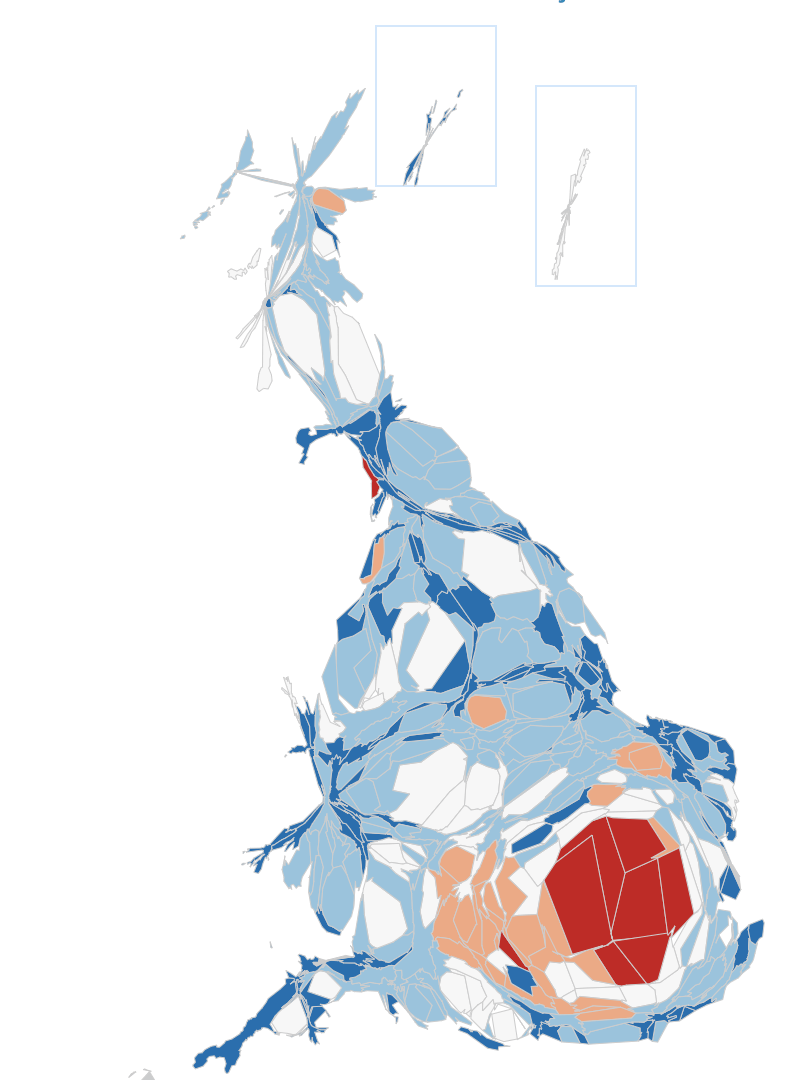
The ONS cartogram visualizes the distribution of jobs across the UK, illustrating not just the number of jobs available but also the average salaries associated with those positions. The color coding on this map ranges from dark red, indicating the highest salaries, to dark blue, representing the lowest. Interestingly, areas depicted in dark red provide an average job salary that is about double that of dark blue regions. This stark contrast in pay highlights not only economic disparities but also can reflect broader trends in employment and industry concentration across the UK.
Deep Dive into Job Pay Distribution in the UK
The topic of job pay distribution in the UK is crucial for understanding economic health and social equity within different regions. The disparity in average salaries can be attributed to a variety of factors, including the types of industries prevalent in certain areas, local cost of living, and educational opportunities. For example, urban centers like London, which are often shaded dark red on the map, tend to host a higher concentration of high-paying sectors such as finance, tech, and creative industries. These sectors typically offer salaries that can be far above the national average, reflecting both the demand for skilled labor and the higher living costs in these areas.
Conversely, regions represented in dark blue often show a reliance on lower-paying industries, such as agriculture or manufacturing, which may have experienced decline in recent years. For instance, parts of Wales and Northern England are frequently colored dark blue, signaling a need for economic revitalization and diversification.
Moreover, the average salaries in these areas can also be influenced by educational attainment levels. Areas with higher educational institutions and training programs often see better job prospects and pay. For example, cities like Cambridge and Oxford, located in dark red areas, benefit from their prestigious universities, which help cultivate a highly skilled workforce. Interestingly, the map underscores how education and job training can significantly impact regional economies.
Regional Analysis
When we break down the map regionally, the differences become even more pronounced. London stands out with its extensive job market and high salaries, but if we move to the West Midlands, represented in a lighter red, we see a mix of industries and a moderate average salary. This area has a growing tech scene and automotive industry, which contributes to its economic landscape. However, it still lags behind London in terms of pay.
In contrast, the North East of England, which displays dark blue on the map, is grappling with the legacies of industrial decline. The average job pay here is notably lower, reflecting not just the types of jobs available but also the economic challenges the region faces. The disparity is not just economic; it affects community well-being and social mobility, raising questions about policy interventions and support.
Interestingly, Scotland shows a mix of light red and grey areas. Cities like Edinburgh and Glasgow manage to maintain higher average salaries in sectors like finance and education, while rural areas face challenges similar to those in the North East of England. This patchwork of job pay distribution invites an exploration of how regional policies might be tailored to address these differences more effectively.
Significance and Impact
Understanding job pay distribution is crucial for multiple stakeholders, from policymakers to job seekers. This map serves as a visual reminder that economic opportunities are not distributed evenly across the UK. The implications of such disparities are significant; they can affect everything from housing affordability to public health outcomes. For example, those living in high-paying areas often have better access to healthcare and education, creating a cycle of privilege.
As we look towards the future, current trends suggest that remote work might begin to alter some of these dynamics. With more companies embracing flexible work arrangements, could we see shifts in job pay distributions? Will individuals move away from high-cost urban centers in search of better quality of life without sacrificing salary? These are questions worth considering as we navigate an evolving job market.
In conclusion, the ONS cartogram not only illustrates the current job pay landscape but also prompts us to think about the broader implications for economic equity in the UK. Addressing these disparities will require a concerted effort from all sectors—government, education, and industry—to ensure that opportunities for well-paying jobs are available to all, regardless of geographic location.
Visualization Details
- Published
- September 6, 2025
- Views
- 76
Comments
Loading comments...