Top 30 Most and Least Developed Countries Map

Alex Cartwright
Senior Cartographer & GIS Specialist
Alex Cartwright is a renowned cartographer and geographic information systems specialist with over 15 years of experience in spatial analysis and data...
Geographic Analysis
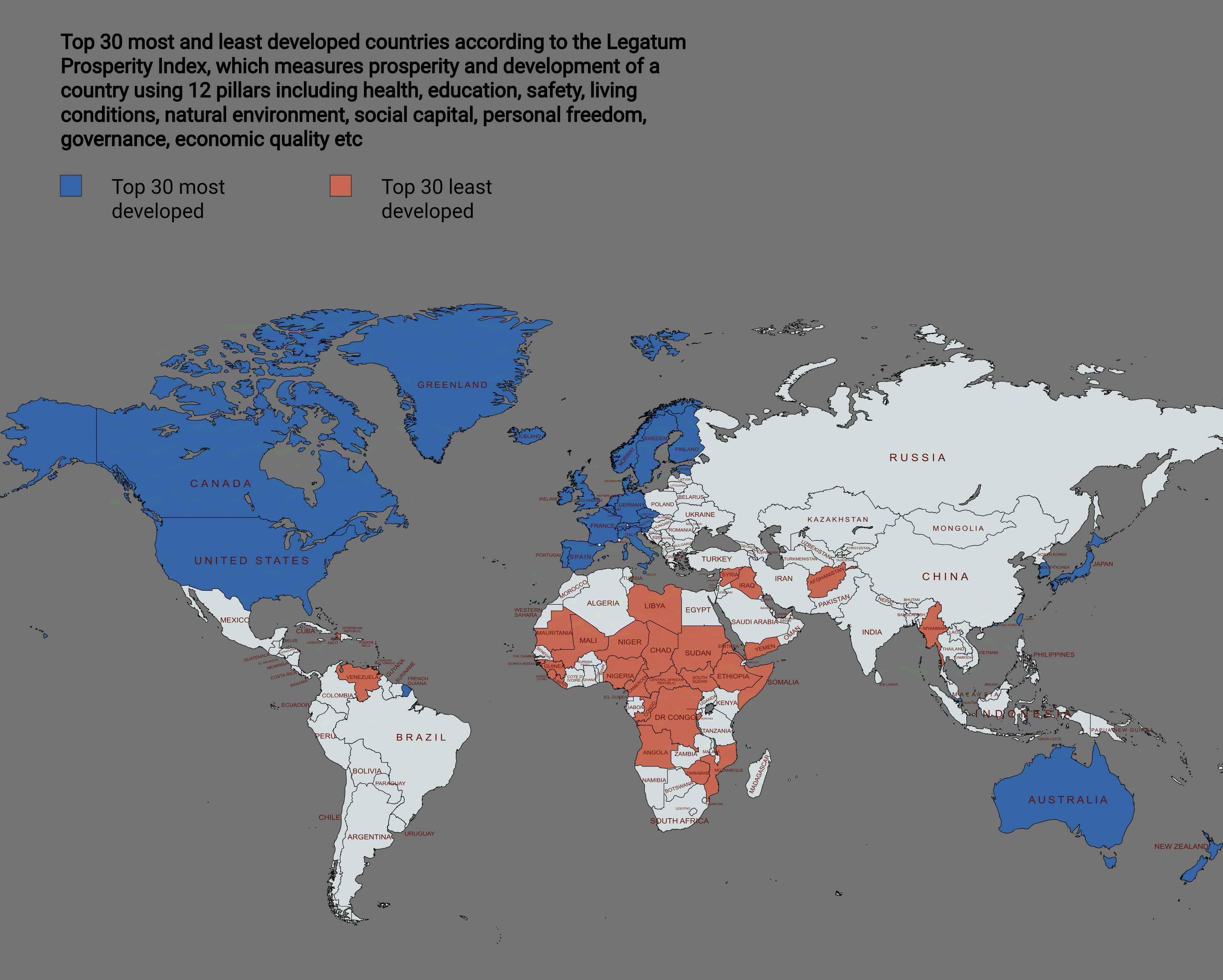
What This Map Shows
This map visually represents the top 30 most and least developed countries based on various socio-economic indicators. It is a stark reflection of global disparities in wealth, education, healthcare, and overall quality of life. With countries shaded differently to indicate their level of development, this visualization provides an immediate understanding of where nations stand on the development spectrum.
Deep Dive into Development
Development is a complex topic that encompasses economic growth, social progress, and environmental sustainability. When we talk about the most developed countries, we often refer to those with high Gross Domestic Product (GDP) per capita, advanced technological infrastructure, and high levels of education and healthcare. For instance, countries like Norway and Switzerland frequently top the charts, boasting GDP per capita figures well above $70,000. Interestingly, these nations also have strong social safety nets and low poverty rates, which significantly contribute to their overall development rankings.
On the flip side, the least developed countries (LDCs) face numerous challenges, including political instability, inadequate infrastructure, and limited access to education and healthcare. Countries such as Burundi and South Sudan are often cited as some of the least developed, with GDP per capita figures under $1,000, highlighting the stark contrast in living standards. What's fascinating is that many LDCs are rich in natural resources yet remain economically disadvantaged. This paradox raises questions about governance, resource management, and the impacts of colonization.
Development is also measured through the Human Development Index (HDI), which considers life expectancy, education, and per capita income. For example, while countries like the United States and Germany rank high on this index, nations in sub-Saharan Africa often score low. Nevertheless, some countries have shown remarkable progress. Ethiopia, for instance, has made significant strides in education and healthcare, improving its HDI ranking over the past decade.
Regional Analysis
When analyzing the regions represented in the map, notable patterns emerge. North America and Western Europe are predominantly filled with developed countries, characterized by strong economies and high living standards. In contrast, much of Africa and parts of Asia struggle with development challenges. However, regions like Southeast Asia are witnessing rapid growth and development, with nations like Vietnam and Indonesia moving up the ranks.
In Latin America, the situation is mixed; countries like Chile and Uruguay are often recognized for their relatively high development levels, while others, like Haiti, lag significantly behind. The Middle East presents a unique case as well, with countries such as Qatar boasting high GDP per capita thanks to oil wealth, while others like Yemen face dire humanitarian crises.
Significance and Impact
Understanding the development status of countries is crucial for a myriad of reasons. For one, it influences global policies, aid distribution, and international relations. Countries with lower development levels often require more support to tackle issues such as poverty, education, and healthcare access. Moreover, this map can help NGOs and governments identify priority areas for intervention.
Current trends indicate a shift towards sustainable development, with an increasing number of nations recognizing the importance of environmental sustainability alongside economic growth. The United Nations’ Sustainable Development Goals (SDGs) aim to address these issues globally, focusing on eradicating poverty, improving education, and promoting gender equality.
Looking ahead, projections suggest that the gap between developed and developing countries may narrow, provided that there is sustained investment in education, infrastructure, and technology. However, challenges such as climate change and geopolitical tensions could hinder progress and exacerbate existing inequalities.
In conclusion, the map of the top 30 most and least developed countries serves as more than just a visual tool; it encapsulates the complex interplay of economics, politics, and social factors that define our world today. Understanding these dynamics is essential for fostering a more equitable global community.
Visualization Details
- Published
- September 3, 2025
- Views
- 90
Comments
Loading comments...