Map of American Households on Income or Food Support

Alex Cartwright
Senior Cartographer & GIS Specialist
Alex Cartwright is a renowned cartographer and geographic information systems specialist with over 15 years of experience in spatial analysis and data...
Geographic Analysis
What This Map Shows
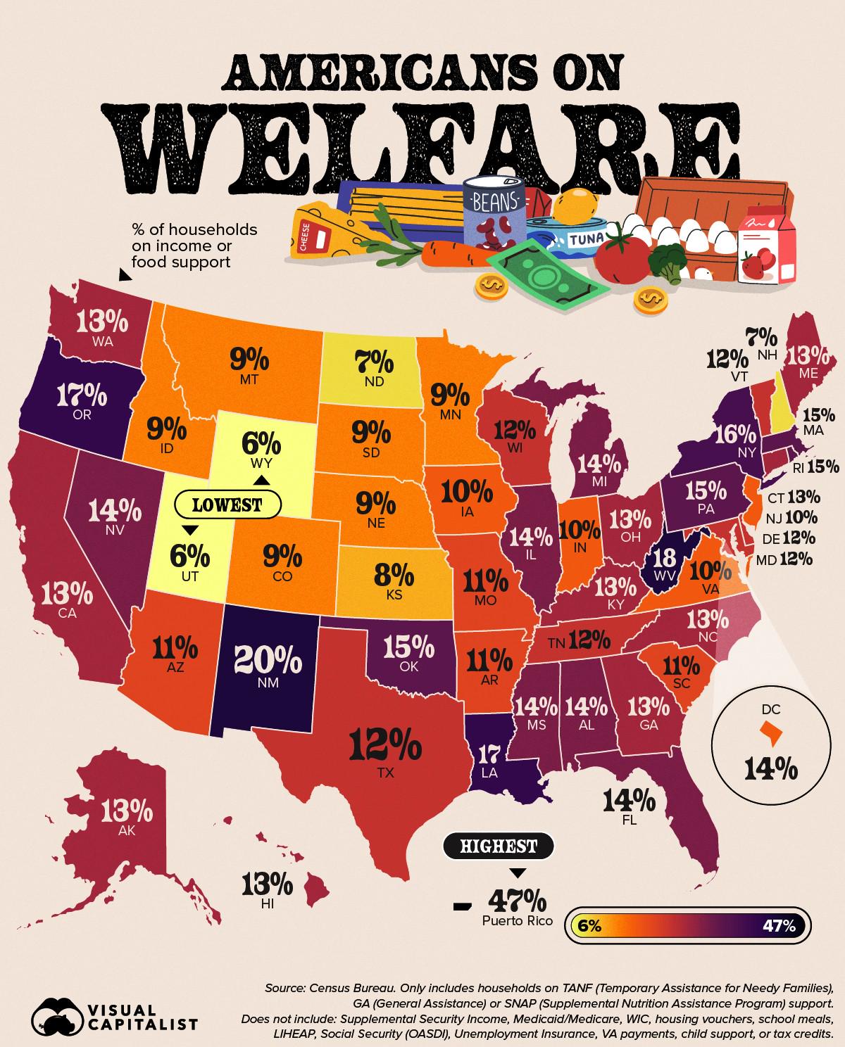
The map titled "Percentage of American Households on Income or Food Support" provides a clear visual representation of the proportion of households across the United States that rely on income assistance or food support programs. Such programs often include Supplemental Nutrition Assistance Program (SNAP), Temporary Assistance for Needy Families (TANF), and other local or state aid initiatives. This visualization highlights the economic disparities that exist within the country, revealing not only which regions are most affected by poverty but also how these challenges are distributed geographically.
Deep Dive into Income and Food Support
Understanding the need for income and food support in America requires examining several interconnected factors, including poverty rates, employment opportunities, and social safety nets. According to the U.S. Census Bureau, approximately 11.4% of Americans were living in poverty as of 2020, which translates to over 37 million individuals. This statistic is not merely a number; it reflects families struggling to meet basic needs, including housing, healthcare, and nutrition.
Ever wondered why certain states or regions have higher percentages of households relying on assistance? The reasons often include economic factors such as unemployment rates, industrial decline, and educational disparities. For example, states with a higher reliance on agriculture or manufacturing may experience fluctuations in income based on market demands. In contrast, urban areas might see a different set of challenges, including high living costs that outpace wage growth.
Interestingly, the demographics of those who seek assistance also provide insight into broader societal trends. Families with children, single-parent households, and communities of color often face higher rates of economic instability, making them more likely to turn to food support programs. These patterns reveal systemic issues that contribute to the cycle of poverty, where lack of access to quality education or job training can perpetuate financial difficulties across generations.
Recent data indicates that food insecurity is a growing concern, particularly in the wake of the COVID-19 pandemic, which exacerbated existing inequalities. In 2020, the rate of food insecurity in the U.S. surged to 10.5%, with certain demographics experiencing rates as high as 30%. This situation underscores the critical need for robust support systems to ensure that all families have access to nutritious food and essential resources.
Regional Analysis
Analyzing the map reveals stark regional differences in the percentage of households on income or food support. For instance, southern states like Mississippi and Louisiana often report some of the highest percentages, with nearly one in five households relying on assistance. This trend can be attributed to a combination of low average wages, high unemployment rates, and limited access to education and healthcare services.
Conversely, states in the Northeast, such as New York and Massachusetts, might show lower percentages of households on support programs, although pockets of high need still exist, particularly in urban areas. What's fascinating is that while these states often provide more comprehensive safety nets, the high cost of living can still leave many families struggling.
Midwestern states like Ohio and Michigan present a mixed picture. Areas that were heavily reliant on manufacturing have seen economic downturns, leading to increased reliance on food support. However, urban centers like Chicago have implemented robust community programs aimed at reducing food insecurity, showcasing a proactive approach to the issue.
Significance and Impact
The significance of understanding the percentage of American households on income or food support cannot be overstated. It is a reflection of the nation’s economic health and social fabric. High levels of reliance on support programs indicate underlying issues that can lead to increased healthcare costs, reduced educational outcomes, and broader social challenges.
As we look to the future, current trends are concerning. Experts predict that without significant policy changes and economic interventions, the number of households relying on income or food support may continue to rise, especially as inflation affects the affordability of basic necessities. The conversation around universal basic income and expanded food assistance programs has gained traction in recent years, emphasizing the urgent need for a robust response to these challenges.
In conclusion, this map serves as a crucial tool for understanding the economic landscape of America. By visualizing the percentage of households on income or food support, we gain insight into the broader social issues at play, the effectiveness of support systems, and the urgent need for continued advocacy and reform. Whether through community initiatives or policy changes, addressing these disparities is essential for fostering a more equitable society.
Visualization Details
- Published
- August 30, 2025
- Views
- 66
Comments
Loading comments...