
David Chen
Data Visualization Specialist
David Chen is an expert in transforming complex geographic datasets into compelling visual narratives. He combines his background in computer science ...
Geographic Analysis
What This Map Shows
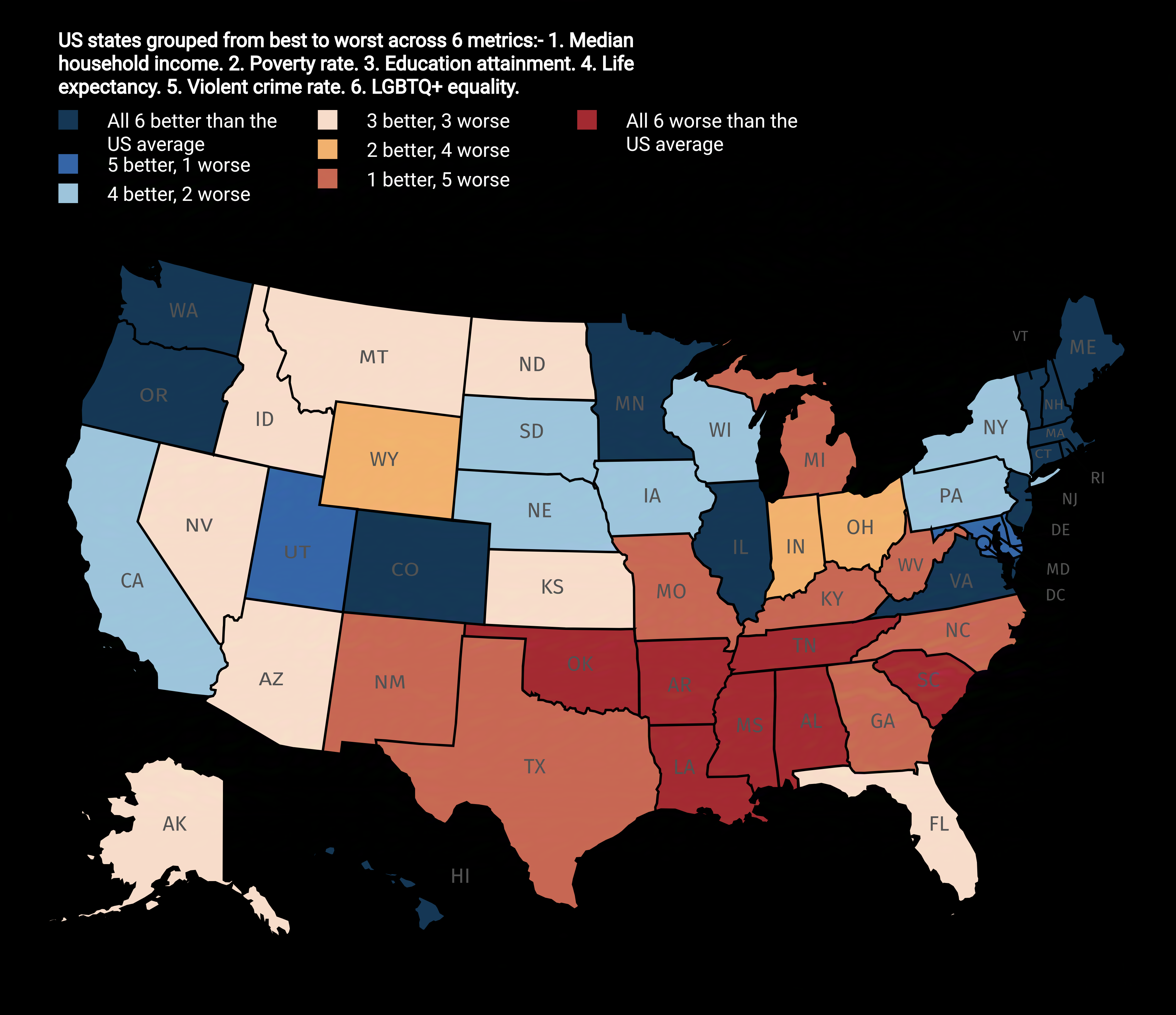
The "US States Ranked from Best to Worst Map" provides a visual representation of how each state in the United States measures against others based on various metrics. These metrics often include quality of life, education, healthcare, economic performance, and safety among others. Such maps can be beneficial for residents, policymakers, and those considering relocation, as they distill complex data into a format that's easy to understand.
However, the implications of ranking states can spark lively discussions about what makes a state favorable or unfavorable. Is it the cost of living? The job market? Or perhaps the quality of education? Let's delve into these nuances.
Deep Dive into State Rankings
When discussing state rankings, it’s important to recognize that different criteria can yield vastly different results. For instance, according to recent studies, states like Massachusetts and Washington frequently rank at the top due to their robust educational systems and strong economies. Massachusetts is particularly noted for its higher education institutions, including Harvard and MIT, which contribute to a highly skilled workforce.
On the other hand, states like Mississippi and Louisiana often find themselves at the bottom of these rankings. Factors contributing to their lower rankings include higher poverty rates, lower educational attainment, and challenges in healthcare access. Interestingly, the socio-economic challenges faced by these states are complex and deeply rooted, often stemming from historical, cultural, and geographical factors.
Moreover, metrics such as healthcare access highlight stark disparities. For example, states like Hawaii and Massachusetts boast some of the highest healthcare quality ratings, while states in the South tend to struggle with access and affordability.
Another fascinating aspect is how climate and geography impact state rankings. States with favorable climates, like California and Florida, attract residents seeking a sunnier, more temperate environment. However, these states also grapple with challenges like high living costs and natural disasters, which can affect overall livability.
Regional Analysis
In examining the map closely, we can identify regional trends. The Northeast, often regarded as a hub of education and healthcare, features states like New York and New Jersey ranking higher. These states benefit from dense urban areas that provide ample job opportunities and cultural experiences.
Conversely, the Midwest displays a mixed bag. States like Minnesota rank highly due to their quality of life and healthcare systems, while others like Ohio may lag due to economic instability. Interestingly, this region is often overlooked when discussing vibrant economies, yet it holds potential for growth in sectors like manufacturing and agriculture.
Looking to the South, states like Texas and Virginia emerge as strong contenders, often praised for their diverse economies and job growth. However, the South also has states that struggle with education and healthcare, revealing a divide that can be traced back to differing state policies and historical investment.
The West presents a unique landscape as well. States like Colorado rank highly for their livability and outdoor recreational opportunities. However, with booming populations, issues such as housing affordability and resource management are becoming pressing challenges.
Significance and Impact
Understanding why these rankings matter is crucial in today’s interconnected world. For policymakers, these rankings can drive decisions about where to allocate resources, how to develop infrastructure, and which social programs need more attention. For residents, knowing where their state stands can influence everything from job opportunities to quality of life.
Interestingly, these rankings are not static. They evolve with changing demographics, economic conditions, and policy implementations. For instance, states that invest in education and healthcare often see improvements in their rankings over time. Moreover, as remote work continues to rise, people are reevaluating what makes a state desirable. Have you noticed how states with lower costs of living are becoming increasingly popular?
In conclusion, the "US States Ranked from Best to Worst Map" is more than just a visualization; it reflects the ongoing narrative of our nation's strengths and challenges. Understanding these dynamics not only enhances our geographical knowledge but also informs our decisions and priorities for the future.
Visualization Details
- Published
- August 25, 2025
- Views
- 156
Comments
Loading comments...