Life Expectancy Compared to Global Average Map

Alex Cartwright
Senior Cartographer & GIS Specialist
Alex Cartwright is a renowned cartographer and geographic information systems specialist with over 15 years of experience in spatial analysis and data...
Geographic Analysis
What This Map Shows
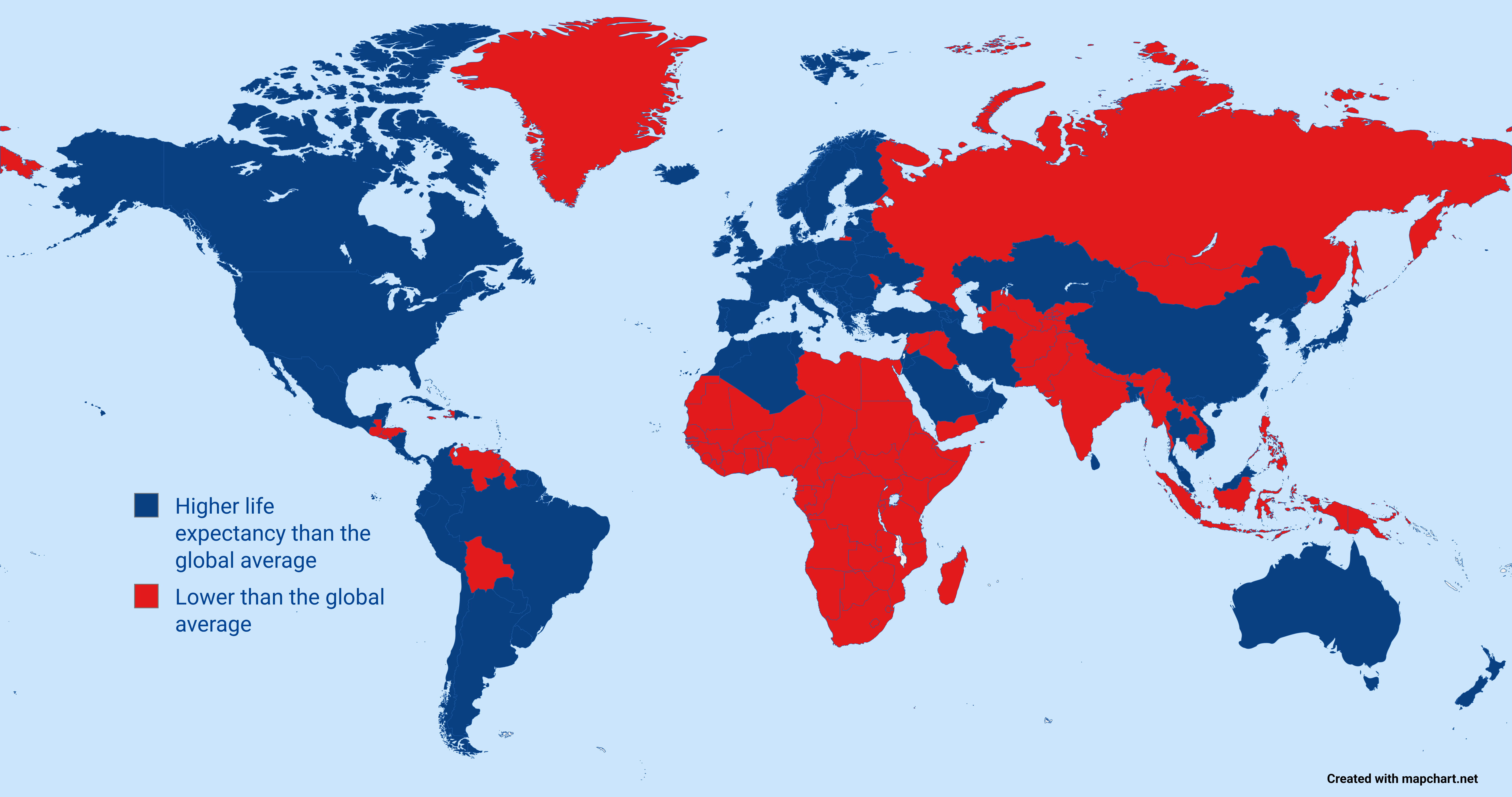
The "Life Expectancy: Higher or Lower Than the Global Average" map, based on UN data from 2023, provides a striking visual representation of how life expectancy varies across the globe. Each country is color-coded to indicate whether its life expectancy is above or below the global average, which, as of the latest data, stands at approximately 73 years. This map not only highlights health disparities but also invites a deeper understanding of the factors that influence longevity in different regions.
Deep Dive into Life Expectancy
Life expectancy is a crucial indicator of a nation's health and well-being, reflecting the average number of years a person is expected to live based on current mortality rates. This figure is influenced by a multitude of factors, including economic conditions, healthcare accessibility, lifestyle choices, and environmental factors.
Interestingly, life expectancy has generally increased over the past century due to advancements in medicine, sanitation, and nutrition. For instance, in 1950, the global average was just 48 years, a stark contrast to today's figures. However, the gains have not been distributed evenly. Regions such as Sub-Saharan Africa still face significant challenges that lead to lower life expectancies, often due to high rates of infectious diseases, malnutrition, and limited access to healthcare services.
In more developed regions, such as North America and Western Europe, life expectancy is significantly higher, often exceeding 80 years. The reasons for this are manifold: robust healthcare systems, healthier lifestyles, and wealthier economies contribute to the longevity seen in these areas. For example, Japan consistently ranks among the highest globally, with an average life expectancy of over 84 years, thanks to factors like a balanced diet, active lifestyles, and a strong healthcare framework.
However, it’s essential to note that life expectancy figures can sometimes mask underlying health issues. For example, while some countries may report high average life expectancies, they may also face issues such as rising obesity rates, mental health challenges, and increased healthcare costs. Thus, while the data may be optimistic, it often invites further questions about the quality of life and the health challenges that may not be immediately apparent from the numbers alone.
Regional Analysis
Breaking down the map, we can observe how different regions fare against the global average. In North America, countries like Canada and the United States boast life expectancies well above the global average. Canada, for instance, has an average of around 82 years, attributed to its universal healthcare system and emphasis on preventive care. In contrast, the United States, despite its wealth, has a lower average of about 79 years, influenced by factors such as healthcare disparities and lifestyle-related health issues.
Moving to Europe, we see a similar trend, with countries like Switzerland and Spain showcasing life expectancies above 83 years. These nations benefit from robust social healthcare systems, healthy diets, and active lifestyles. On the other hand, Eastern European countries, such as Bulgaria and Romania, tend to fall below the global average, largely due to economic challenges and higher rates of alcohol-related health issues.
In Asia, the map reveals a mixed picture. Countries like Singapore and South Korea report some of the world's highest life expectancies, reaching above 84 years, thanks to advanced healthcare systems and public health initiatives. Conversely, parts of South Asia, particularly India and Bangladesh, grapple with lower life expectancies due to high levels of poverty, malnutrition, and inadequate healthcare infrastructures.
Africa presents the most significant disparities. While countries like Morocco and Algeria show life expectancies closer to the global average, much of Sub-Saharan Africa continues to face challenges, with countries like Nigeria and Chad reporting averages closer to 54 years. These discrepancies are often attributed to factors such as high rates of infectious diseases, lack of healthcare access, and political instability.
Significance and Impact
Understanding life expectancy is more than just numbers; it’s about grasping the broader implications for societies and economies. Countries with higher life expectancies often enjoy better economic stability, as healthier populations can contribute more effectively to the workforce. Conversely, countries with lower life expectancies may struggle with economic development and face mounting healthcare costs.
Interestingly, trends suggest that life expectancy may be on the rise globally due to ongoing improvements in healthcare and living conditions. However, the COVID-19 pandemic has had a profound impact, particularly on countries with already fragile health systems, potentially reversing some of the gains made in recent decades.
In conclusion, the life expectancy map serves as a powerful reminder of the health inequalities that persist across the globe. It highlights the urgent need for policies that address these disparities, improve healthcare access, and promote healthier lifestyles. The journey towards a world where everyone can achieve a long and healthy life continues, and it’s a path that requires collective effort and commitment.
Visualization Details
- Published
- October 17, 2025
- Views
- 8
Comments
Loading comments...