Mercator Projection Circle Distortion Map

Marcus Rodriguez
Historical Geography Expert
Marcus Rodriguez specializes in historical cartography and geographic data analysis. With a background in both history and geography, he brings unique...
Geographic Analysis
What This Map Shows
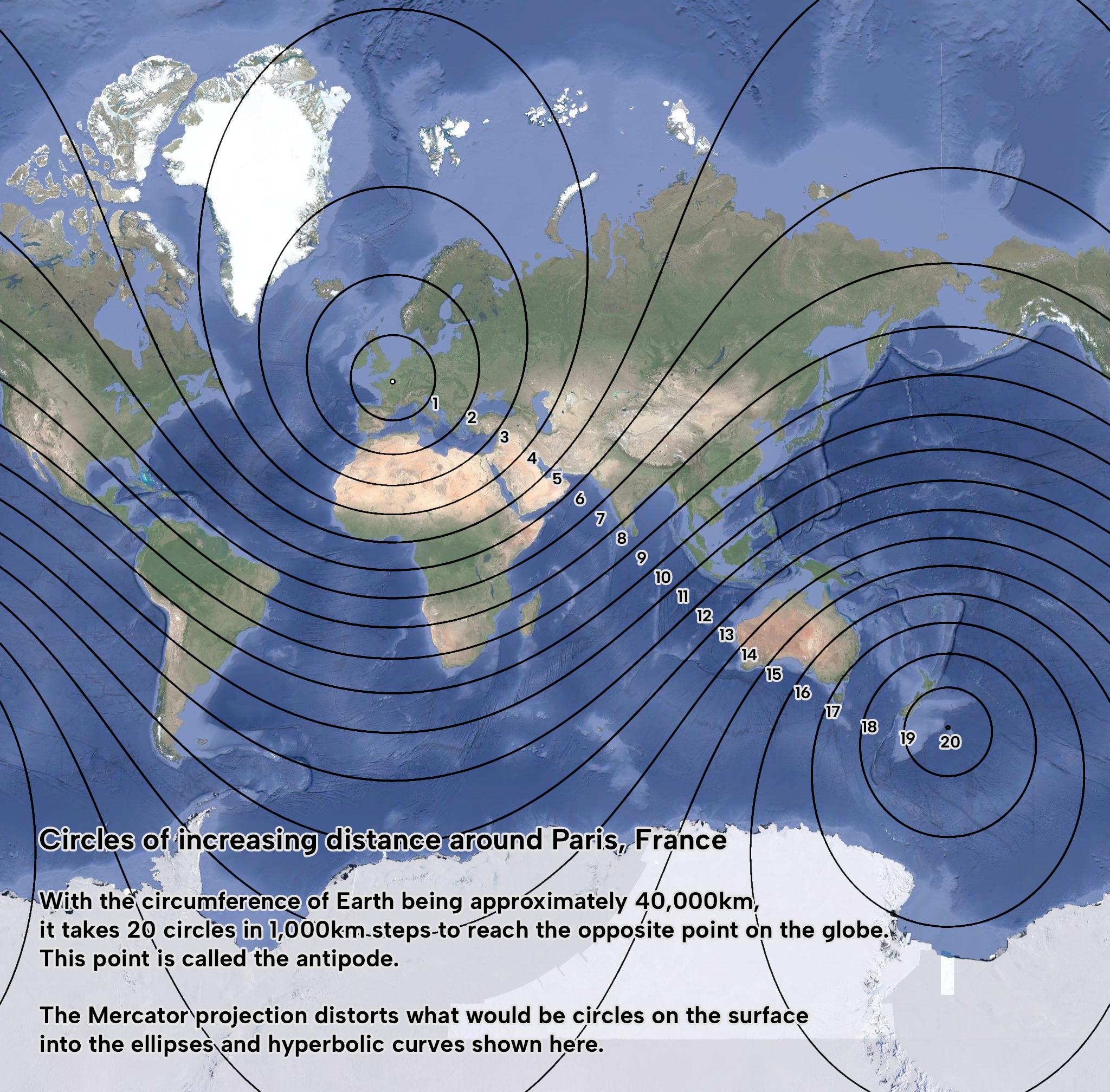
The visualization titled "What circles of increasing size centered around Paris, France really looks like with the Mercator projection" effectively illustrates how the Mercator projection distorts circular areas as they expand outward from a focal point. While the map is centered on Paris, it serves as a compelling example of how this well-known projection impacts our understanding of geographical space. As we explore the implications of this distortion, we can better appreciate both the utility and the limitations of the Mercator projection in representing our world.
Deep Dive into Projection Distortion
The Mercator projection, created by Gerardus Mercator in 1569, was designed primarily for maritime navigation. Its unique ability to represent angles accurately makes it invaluable for sailors charting a course across the ocean. However, this accuracy comes at a cost: significant distortion of scale, particularly as one moves away from the equator.
Ever wondered why Greenland appears so enormous on a Mercator map? In reality, Greenland is roughly the same size as the Democratic Republic of the Congo, yet on the Mercator projection, it occupies a much larger area. This phenomenon is a direct result of how the projection stretches the latitudes as they move from the equator towards the poles. The further you are from the equator, the more pronounced the distortion becomes.
When we talk about circles on a map, we typically think of perfect geometric shapes. However, as seen in the visualization, these circles morph into irregular shapes as they expand outward from Paris. This distortion becomes particularly stark in high-latitude regions, where the circular representation can take on elongated forms reminiscent of a guitar pick, rather than maintaining its intended symmetry. This has significant implications for various fields, including urban planning, environmental studies, and even social sciences, where accurate spatial representation is crucial.
Interestingly, while the Mercator projection is widely used, alternative projections like the Robinson or the Winkel Tripel have been developed to mitigate these distortions. These alternatives offer a more realistic representation of landmasses, although they may sacrifice some navigational accuracy. As we continue to rely on maps for everything from navigation to education, understanding these differences is essential for making informed decisions based on spatial data.
Regional Analysis
The distortion caused by the Mercator projection varies dramatically across different regions. For instance, in Europe, areas closer to the equator, such as southern Spain, maintain a more accurate representation in size and shape compared to countries further north, like Norway. Meanwhile, in Africa, the differences in size can lead to misconceptions about resource distribution. For example, Nigeria appears much smaller than it actually is in comparison to countries like Algeria when viewed on a Mercator map.
In the Americas, we see similar variations. Countries like Canada and the United States appear disproportionately large compared to their actual geographic size when viewed on the Mercator projection. This can lead to misunderstandings about population density and resource availability between countries in different latitudes.
Furthermore, the visualization emphasizes that as circles drawn around Paris increase in size, the true area that these circles cover becomes less representative of reality, especially in northern regions. This highlights the importance of considering the geographic context when interpreting data on a Mercator map. For instance, if a policy decision is based on population density within these distorted circles, it could lead to significant miscalculations.
Significance and Impact
Understanding the implications of projection distortion is more than just an academic exercise; it has real-world consequences. In an era where geographic information plays a crucial role in everything from urban planning to resource allocation, misrepresentations can lead to misguided policies and ineffective resource management.
As we become increasingly reliant on digital mapping technologies, the need for accuracy in spatial representation becomes ever more critical. Trends in environmental changes, population migrations, and urban development all depend on our ability to visualize data correctly. The Mercator projection may still serve its purpose in certain contexts, but it is vital for users to recognize its limitations and consider alternatives that offer more accurate portrayals of our planet.
In conclusion, while the Mercator projection has its strengths, the visualization of expanding circles around Paris reminds us of the complexities involved in map-making. By fostering a deeper understanding of these issues, we can navigate the world with a more nuanced perspective, ensuring that our geographic literacy serves us well into the future.
Visualization Details
- Published
- September 30, 2025
- Views
- 50
Comments
Loading comments...