White Population by US Congressional District Map

David Chen
Data Visualization Specialist
David Chen is an expert in transforming complex geographic datasets into compelling visual narratives. He combines his background in computer science ...
Geographic Analysis
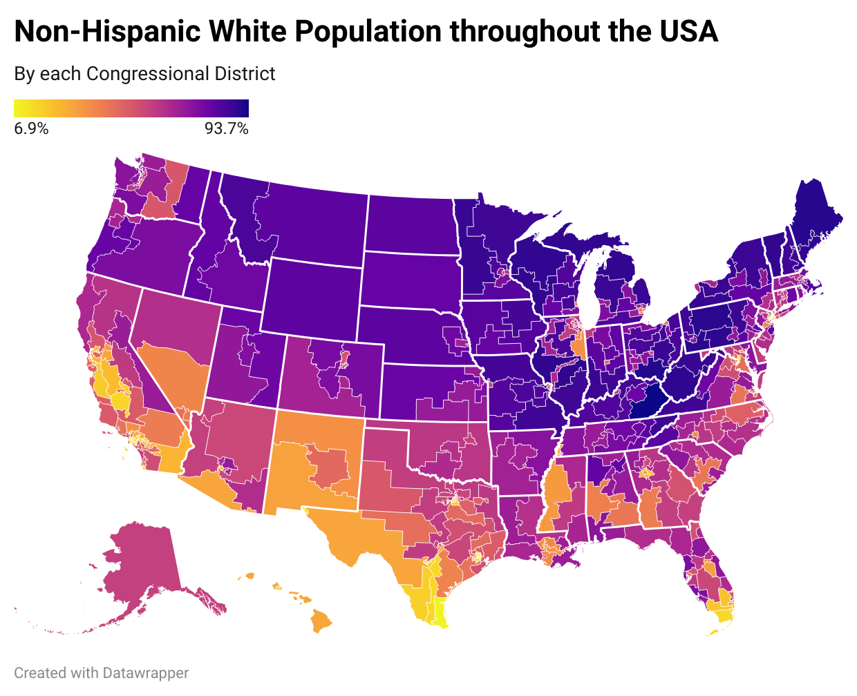
What This Map Shows
The "White Population by US Congressional District Map" visualizes the percentage of the white population residing in each congressional district across the United States, based on data from the 2020 US Census. The map employs a color gradient to indicate varying concentrations of white individuals in different districts, revealing significant geographical and demographic trends across the country.
At first glance, this visualization might seem like just another map, but it serves as a window into the changing landscape of American demographics. Understanding these patterns is crucial, especially as they relate to political representation, resource allocation, and social dynamics within communities.
Deep Dive into White Population Distribution
The white population in the United States represents a substantial portion of the overall demographic landscape. According to the 2020 Census, approximately 61.6% of the total population identifies as white, which includes individuals of European descent and those who identify as white in conjunction with other ethnicities. However, this percentage varies significantly from district to district due to historical migration patterns, economic opportunities, and social factors.
Interestingly, the distribution of the white population is not uniform across the U.S. Urban areas tend to have a more diverse population, with a lower percentage of white residents, while rural areas often exhibit a higher concentration of white individuals. For example, districts in the Midwest and parts of the South showcase some of the highest percentages of white populations, often reflecting the historical settlement patterns and economic development in these regions.
What’s fascinating is how these demographic trends influence not just the cultural fabric of neighborhoods, but also the political landscape. Districts with a higher percentage of white residents may lean toward particular political ideologies, impacting Congressional representation and policy-making. For instance, predominantly white districts in the rural Midwest often support conservative candidates, whereas more diverse districts in urban centers tend to favor liberal policies.
Additionally, the implications of this demographic makeup extend to education, healthcare, and economic opportunities. Areas with a higher concentration of white residents may have different access to resources and services compared to more diverse districts. Understanding these disparities is essential for policymakers aiming to address inequality and foster inclusive growth.
Regional Analysis
When we break down the map by regions, some intriguing patterns emerge. In the Northeast, for instance, states like Maine and Vermont show particularly high percentages of white populations, with many congressional districts reflecting 90% or more. This concentration is largely due to historical settlement patterns and the socio-economic dynamics of these areas, which have seen slower rates of immigration compared to larger metropolitan areas.
In contrast, districts in states such as California and New York present a more complex demographic picture. Urban districts in these states often reveal a lower percentage of white residents, reflecting the significant immigrant populations and ethnic diversity. For example, Los Angeles County’s congressional districts are characterized by a rich tapestry of cultures, with white residents comprising a smaller share of the population.
Interestingly, the South showcases a mix of both high and low percentages of white populations. While some districts in rural Alabama may have percentages nearing 70% to 80%, urban centers like Atlanta illustrate a more diverse demographic, mirroring trends found in other major cities.
Significance and Impact
Understanding the distribution of the white population across congressional districts is more than just a statistical exercise; it has profound implications for understanding societal dynamics in the U.S. As demographics shift, so too do the needs and priorities of communities. The rise of multiculturalism and the declining percentage of the white population in certain areas signal a need for policies that address the challenges and opportunities of a diverse society.
Moreover, this map highlights the importance of representation. Congressional districts with predominantly white populations may face different challenges than those with a more diverse demographic, from economic development to educational funding. Future projections suggest that the U.S. will continue to become more diverse, making it imperative for policymakers and community leaders to adapt and respond to these changes proactively.
In conclusion, the "White Population by US Congressional District Map" is an essential tool for understanding the intricacies of American demographics. By analyzing these patterns, we can better comprehend the socio-political landscape and work toward a more inclusive future for all residents, regardless of their racial or ethnic background.
Visualization Details
- Published
- September 25, 2025
- Views
- 36
Comments
Loading comments...