Europe Working Population in Industry Map

David Chen
Data Visualization Specialist
David Chen is an expert in transforming complex geographic datasets into compelling visual narratives. He combines his background in computer science ...
Geographic Analysis
What This Map Shows
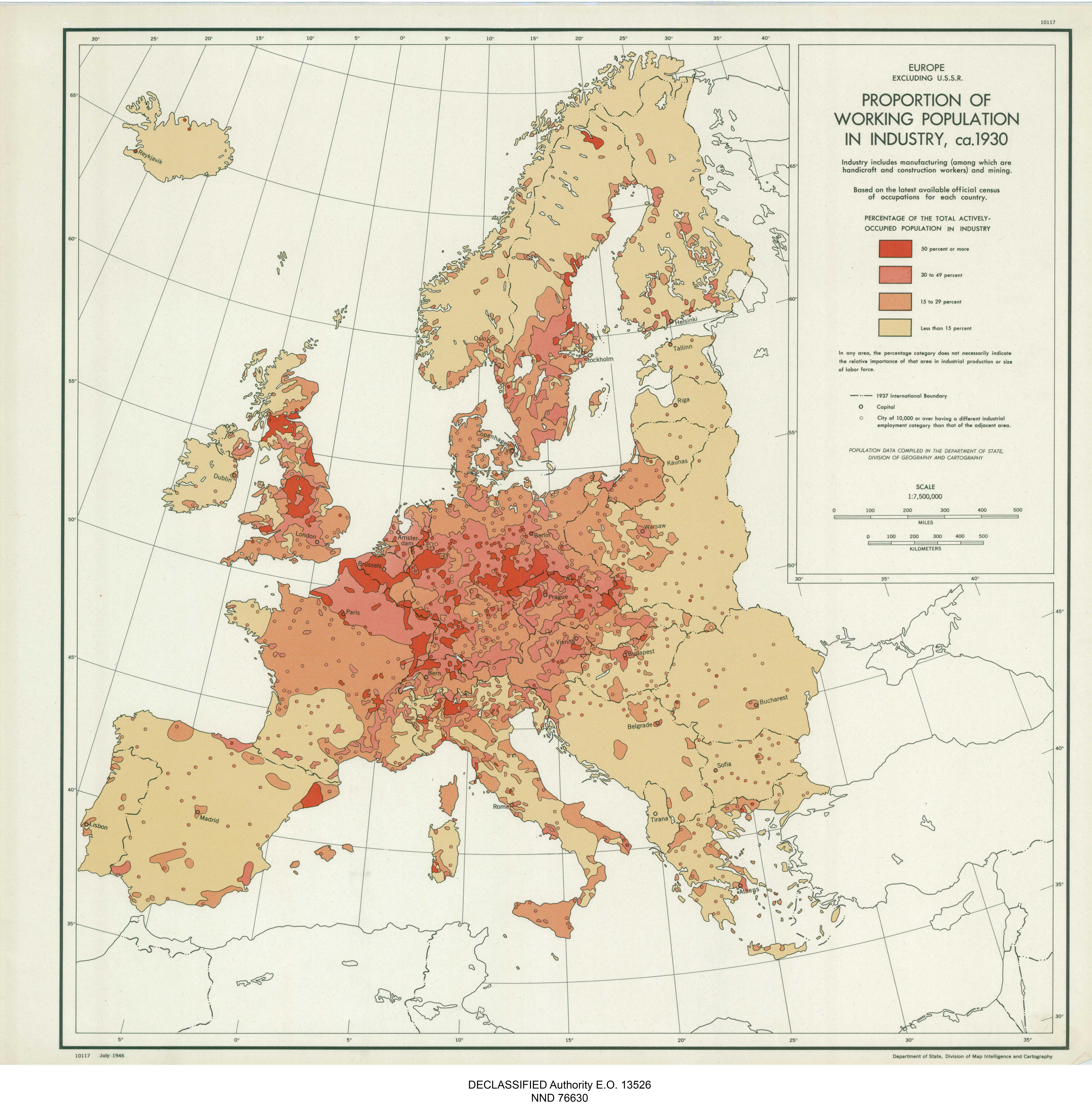
The map titled "Europe Proportion of Working Population in Industry, ca. 1930" offers a fascinating glimpse into the industrial landscape of Europe during the early 20th century. It illustrates the percentage of the working population engaged in industrial activities across various European countries. By examining this visualization, we can understand not only the economic fabric of the continent at that time but also the socio-political dynamics that influenced industrial growth and labor patterns.
Deep Dive into the Industrial Landscape
The early 20th century was a transformative period for Europe, marked by rapid industrialization that reshaped societies and economies. Industry, encompassing manufacturing, mining, and construction, became the backbone of many European economies, especially following the Industrial Revolution that began in the late 18th century. By 1930, countries like Germany, the United Kingdom, and France had substantial proportions of their populations working in these sectors, reflecting their advanced industrial capabilities.
Interestingly, the map reveals stark contrasts in industrial employment rates across Europe. For instance, Germany had one of the highest proportions of its workforce in industry, significantly attributed to its strong manufacturing base and technological advancements. The rise of the Ruhr area as an industrial powerhouse is a notable example of how geographical advantages, such as coal and iron ore deposits, spurred growth in this sector.
In contrast, countries like Spain and Portugal exhibited lower industrial employment percentages, often relying more on agriculture and less on manufacturing. This disparity can be traced back to varying levels of economic development and the timing of industrialization. While Western European nations were rapidly modernizing, Southern European countries lagged, maintaining more traditional economies.
Furthermore, the interwar period saw the rise of labor movements and demands for better working conditions, driven by the harsh realities of industrial labor. This map serves as a historical snapshot, showing how industrial employment was not just a matter of economic necessity but also a catalyst for social change, leading to the formation of unions and labor rights movements that would shape future policies.
Regional Analysis
When we analyze the map regionally, the differences in industrial workforce proportions become even more pronounced. For example, in Northern Europe, particularly in countries like Sweden and Finland, the industrial workforce was significant, reflecting their early adoption of industrial practices and the establishment of robust manufacturing sectors.
Meanwhile, Eastern Europe presented a mixed picture. Nations such as Poland and Czechoslovakia had burgeoning industrial sectors, but they were still grappling with the legacies of agrarian economies. The percentage of the workforce engaged in industry was lower compared to their Western counterparts, but growth was evident as these nations began to industrialize more aggressively in the wake of World War I.
Southern Europe, on the other hand, showed a stronger attachment to agriculture, with countries like Italy and Greece having a significant portion of their populations still tied to farming and agrarian lifestyles. This region's industrialization was slower, influenced by both economic conditions and political instability, particularly in the wake of the Great Depression.
Significance and Impact
Understanding the proportion of the working population in industry during this time is crucial for several reasons. Firstly, it highlights the economic disparities that existed across Europe, which have continued to influence regional development trajectories even into the 21st century. Countries that embraced industrialization earlier often found themselves with more robust economies, while those that lagged have faced ongoing challenges in transitioning to modern economies.
Moreover, this map illustrates the social implications of industrial employment. The rise of the industrial workforce contributed to urbanization, as people flocked to cities in search of work, fundamentally altering demographic patterns. This urban migration led to the growth of cities, but also to challenges such as overcrowding, inadequate housing, and social unrest.
Today, as we navigate through the complexities of globalization and technological advancement, it’s intriguing to consider how historical industrial patterns inform current labor markets. Have you noticed that many of the regions with high industrial employment in 1930 have evolved into centers of innovation and technology? The legacy of industrialization continues to shape economic policies and labor dynamics across Europe.
In conclusion, the "Europe Proportion of Working Population in Industry, ca. 1930" map is not just a historical artifact; it is a window into understanding the foundation of modern Europe. As we reflect on this data, we can better appreciate the ongoing evolution of labor markets and economic strategies that have been influenced by this industrial past.
Visualization Details
- Published
- August 31, 2025
- Views
- 76
Comments
Loading comments...