Total Summer Olympic Medals Map Since 1896

Alex Cartwright
Senior Cartographer & GIS Specialist
Alex Cartwright is a renowned cartographer and geographic information systems specialist with over 15 years of experience in spatial analysis and data...
Geographic Analysis
What This Map Shows
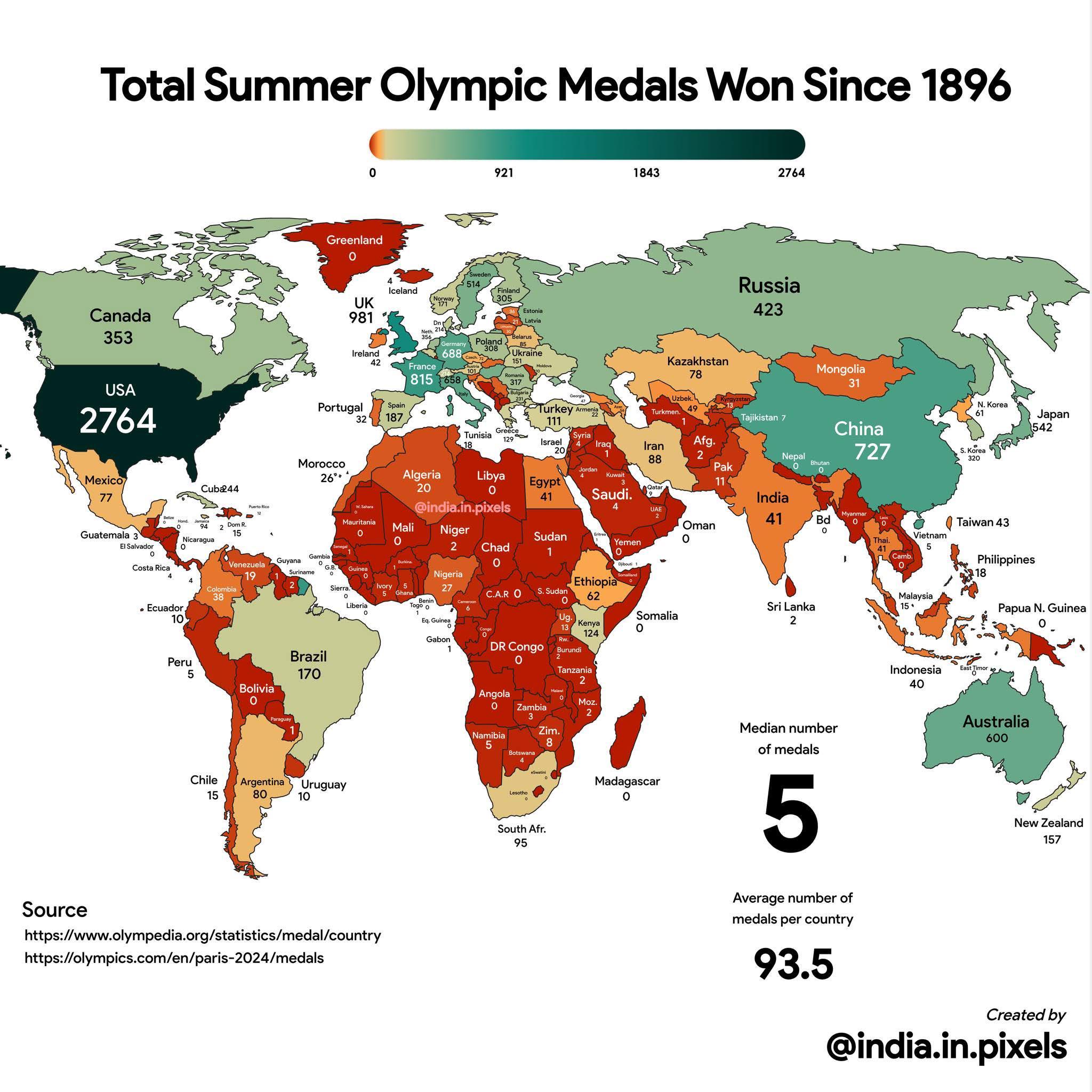
The map titled "Total Summer Olympic Medals Won Since 1896" provides a comprehensive visualization of the medal counts achieved by various nations in the Summer Olympics, starting from the inaugural games held in Athens, Greece. Each country is represented with a color-coded scheme that highlights its total medal tally, showcasing both gold, silver, and bronze medals won over the years. This visualization allows us to quickly grasp the competitive landscape of the Olympics and understand how different countries have excelled in various sports throughout history.
Deep Dive into Olympic Medal Distribution
The Summer Olympics, established in 1896, have evolved into one of the most prestigious international sporting events, drawing athletes from around the globe. The distribution of medals is not merely a reflection of athletic prowess but also of a country's investment in sports, its population size, and its cultural emphasis on athletic success. Interestingly, the historical context plays a significant role in medal distributions; for instance, countries that have been politically stable and economically prosperous tend to perform better.
Let's take a closer look at the trends in Olympic medals. The United States, with its vast resources and a rich sports culture, has dominated the medal tally, amassing more than 2,600 medals across the history of the Summer Games. This dominance is particularly noticeable in sports like swimming, athletics, and basketball. In contrast, countries with smaller populations or limited resources, such as the Bahamas or Jamaica, have achieved remarkable success in specific events, notably sprinting, thanks to their targeted athletic programs and cultural emphasis on track and field.
What's fascinating is the rise of nations that were once considered underdogs. For example, countries like China and Russia have made significant strides in the medal standings over the last few decades, attributed to increased investment in sports infrastructure and training programs. China, in particular, has rapidly ascended the ranks since the 2000 Sydney Olympics, showcasing its prowess in gymnastics, diving, and table tennis.
The map also highlights the shifts in athletic focus over the years. For instance, many Western nations dominated the early Olympics, but as sports have diversified, nations like Kenya and Ethiopia have excelled in long-distance running, illustrating how geography and climate can influence athletic specialization. Moreover, the introduction of new sports—such as skateboarding and surfing—into the Olympic program reflects evolving interests and participation levels, particularly among younger athletes.
Regional Analysis
When analyzing the map, it's crucial to consider regional variations in medal success. North America, particularly the United States and Canada, consistently performs well in a broad range of sports. In contrast, European countries like Germany and Great Britain have also maintained strong performances, particularly in team sports and cycling.
Meanwhile, Asia shows a fascinating dichotomy: countries like China and Japan have excelled in various disciplines, while others, like India, are still striving to make a mark, mainly in sports like wrestling and badminton. Africa, on the other hand, is often represented by a few standout nations such as Kenya and Ethiopia, known for their long-distance running, while many countries still seek to increase their Olympic presence.
Moreover, Oceania, represented by Australia and New Zealand, has shown consistency in swimming and rowing, capitalizing on their unique geographic advantages. However, smaller island nations often struggle to compete on the global stage, reflecting disparities in resources and training opportunities.
Significance and Impact
Understanding Olympic medal distribution is vital for various reasons. Firstly, it reflects national pride and identity; a country's performance can spark a sense of unity and motivation among its citizens. Furthermore, the map can inform policymakers about where to focus investments in sports development, education, and infrastructure.
Interestingly, as we look to the future, the Tokyo 2020 Olympics, held in 2021 due to the pandemic, revealed new challenges and opportunities. The impact of COVID-19 on training regimens and international travel has forced many nations to adapt. As we approach the upcoming Olympic Games, nations are keenly aware that securing medals can influence national morale and international reputation.
In conclusion, the total Summer Olympic medals map is not just a reflection of past performances; it serves as a barometer of athletic development and national investment in sports. With each Olympic cycle, we see how countries adapt, evolve, and strive for excellence, making the world of sports a dynamic and ever-changing landscape that connects people globally.
Visualization Details
- Published
- August 28, 2025
- Views
- 62
Comments
Loading comments...