Immigrant Population Percentage by Country Map

David Chen
Data Visualization Specialist
David Chen is an expert in transforming complex geographic datasets into compelling visual narratives. He combines his background in computer science ...
Geographic Analysis
What This Map Shows
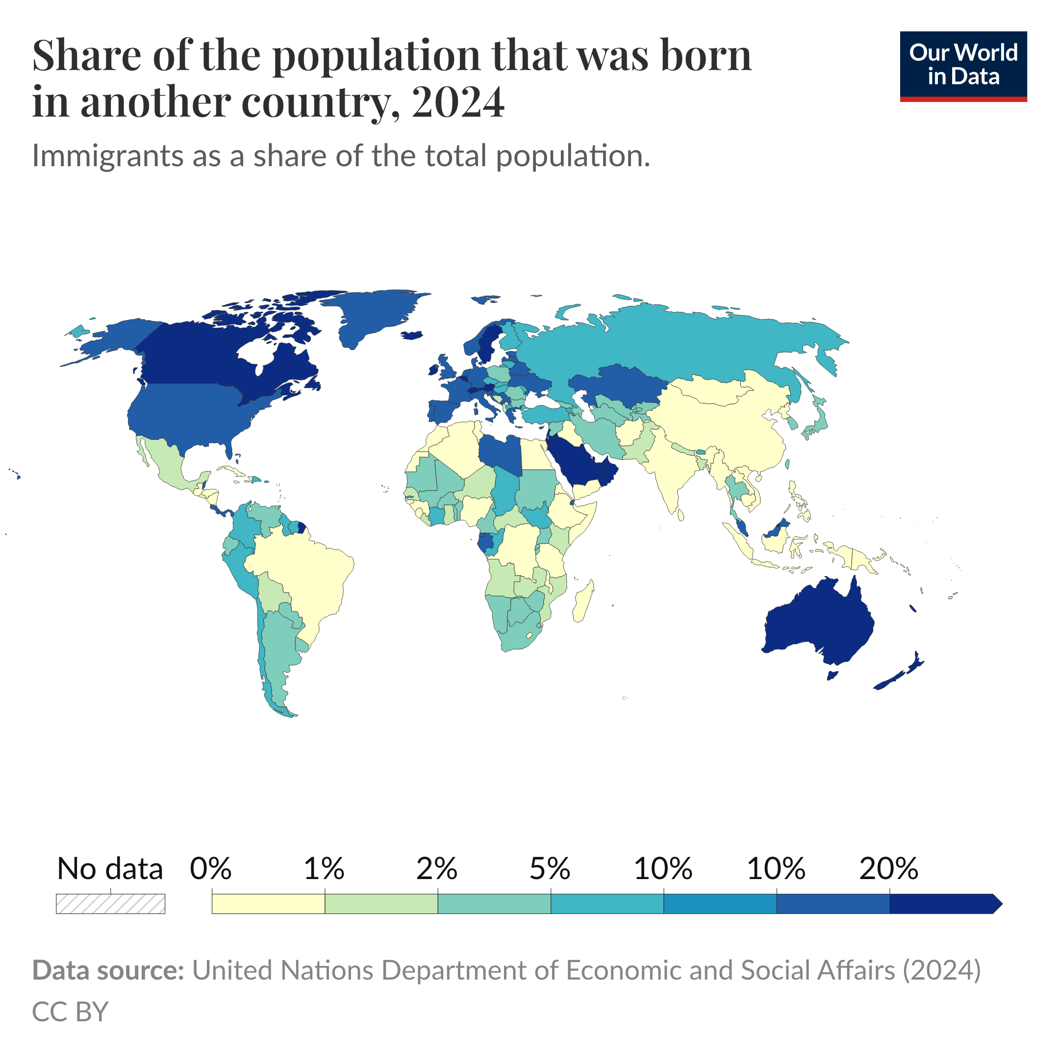
The map titled "Which countries have the highest % of population that are immigrants?" provides a visual representation of the percentage of immigrants relative to the total population across various countries. This compelling visualization allows us to understand the global landscape of migration, highlighting the nations where immigrants form a significant part of the demographic fabric. It captures a snapshot of international migration patterns, showcasing how some countries have become melting pots of different cultures due to high levels of immigration.
Deep Dive into Immigration Trends
Immigration is a crucial aspect of global demographics and societal transformation. As of recent data, countries like the United Arab Emirates, Qatar, and Kuwait stand out with immigrant populations that surpass 80% of their total population. This phenomenon can be attributed to several factors, including economic opportunities, political stability, and social infrastructure that attract individuals from various nations seeking a better life.
Interestingly, the reasons behind immigration are multifaceted. Economic migrants often relocate to countries with flourishing job markets or higher standards of living. For instance, the oil-rich nations in the Gulf Cooperation Council (GCC) have historically attracted workers from South Asia, Southeast Asia, and other regions due to lucrative job offers in construction, services, and oil industries. In contrast, countries like Canada and Australia have developed immigration policies that favor skilled workers, leading to a diverse immigrant landscape.
Moreover, historical context plays a significant role. Countries that have long been settled by immigrants, such as the United States and Australia, continue to attract newcomers thanks to established communities and support systems. As of the latest figures, immigrants comprise about 15% of the U.S. population, reflecting its identity as a nation of immigrants.
What’s fascinating is that immigration rates can vary dramatically even among neighboring countries. For example, while Canada has a robust immigration program, the United States has recently seen fluctuating policies that affect migration patterns. Additionally, the refugee crisis from regions experiencing conflict, such as Syria, has led to increased migration to countries in Europe. This shift has resulted in countries like Germany and Sweden experiencing significant increases in their immigrant populations in recent years.
The impact of immigration is also evident in cultural diversity, economic growth, and demographic changes. Immigrants contribute to labor markets, fill skill gaps, and stimulate economic activity. However, it can also lead to social tensions and challenges in integration, making it a complex issue that requires thoughtful policies and community engagement.
Regional Analysis
When examining the map, we can identify distinct regional patterns in immigration. In the Middle East, the high percentage of immigrants is largely due to the demand for labor in various sectors, particularly in the GCC countries. For instance, in the United Arab Emirates, over 88% of the population consists of expatriates, largely from South Asia, who come for job opportunities in construction, hospitality, and healthcare.
In contrast, Europe presents a different scenario. Countries like Germany have seen a surge in immigrant populations, especially following the Syrian refugee crisis. As of recent estimates, approximately 12% of Germany's population consists of immigrants, many of whom are seeking asylum and a new start. This is in stark contrast to Eastern European countries like Poland, where the percentage of immigrants is significantly lower, reflecting different economic conditions and migration policies.
In North America, the immigrant population is diverse, with Canada leading with about 21% of its population being foreign-born. The country’s welcoming immigration policies and multicultural ethos have made it a beacon for immigrants from around the world. Meanwhile, the United States, with its rich history of immigration, still welcomes millions each year, though recent political climates have posed challenges to this tradition.
Significance and Impact
Understanding the percentage of immigrants within a country's population is crucial for several reasons. It sheds light on the dynamics of labor markets, cultural exchanges, and social cohesion. Countries with high immigrant populations often benefit from cultural diversity, which can lead to innovation and economic growth. However, they also face challenges related to integration, social services, and public sentiment toward newcomers.
The current trends in immigration are also vital to monitor, as they reflect global events such as conflicts, economic shifts, and climate change. For example, as climate change displaces populations, we may see an increase in migration from vulnerable regions to more stable areas. Looking ahead, immigration will continue to shape the demographic landscape of nations and influence global interactions.
In conclusion, the map not only highlights the countries with the highest percentages of immigrant populations but also opens the door to understanding the intricate web of factors that drive migration. As we navigate an increasingly interconnected world, the implications of these trends will play a significant role in shaping future societies.
Visualization Details
- Published
- September 3, 2025
- Views
- 126
Comments
Loading comments...